Aphrology
Brand Identity
A brand identity connecting scientific innovation with a timeless expression of beauty. Created by Lorenzo Rocco at Elle Visual, this project brings together logo design, visual identity and print materials for a technology-driven beauty company.
The Client
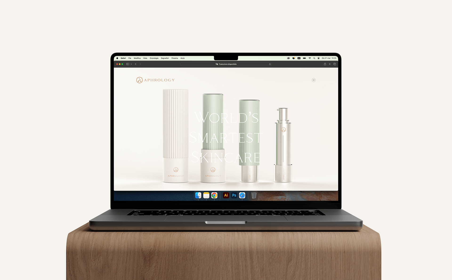
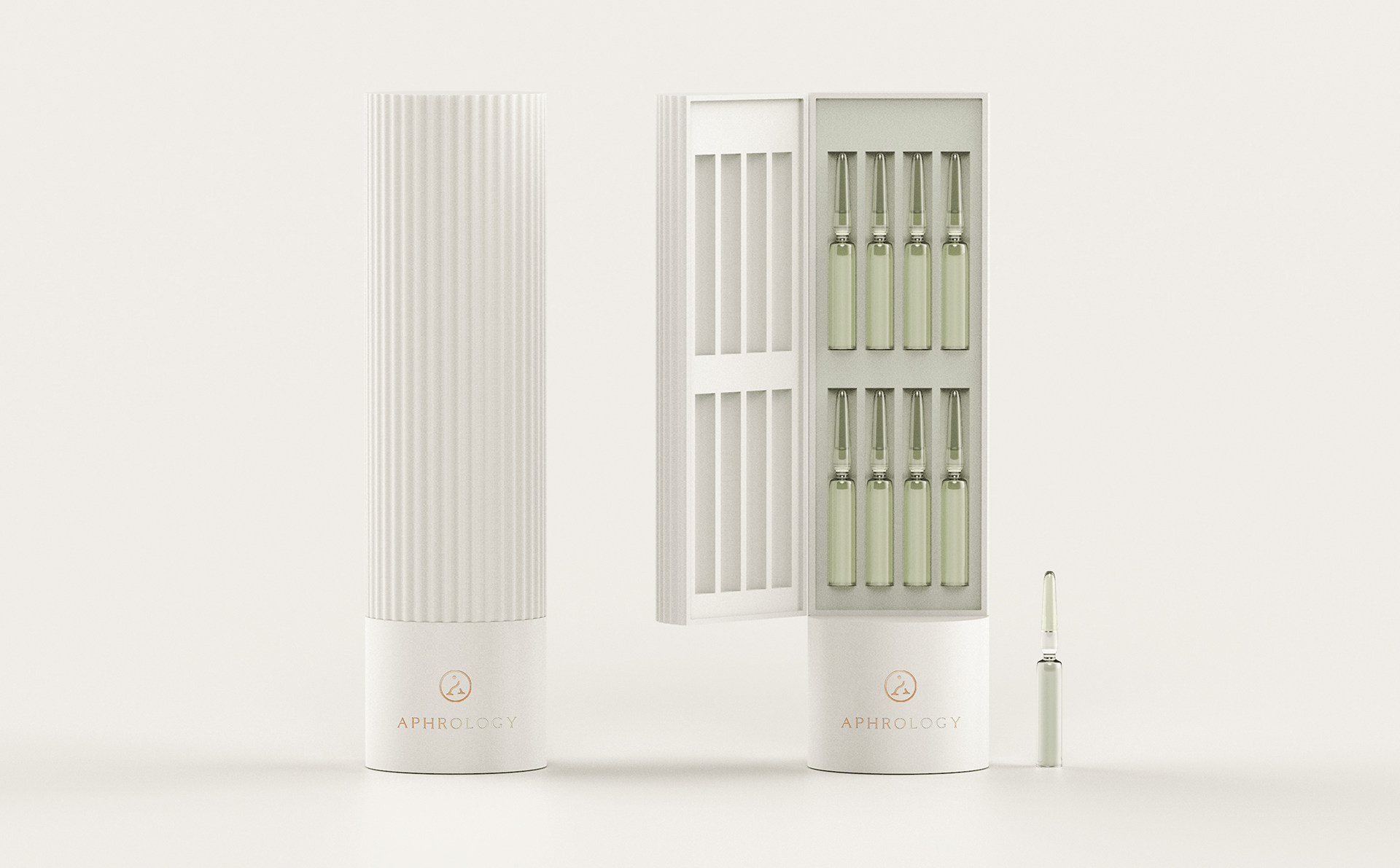
Aphrology is a beauty company whose approach combines skincare with advanced delivery technology. Its proprietary Smart Capsule system is designed to integrate multiple product functions and adapt to individual user needs, drawing on expertise across materials science, chemistry and biomedicine.
The brand identity needed to make this technical proposition approachable while expressing the care and aspiration associated with beauty. For Elle Visual, the central design challenge was to give scientific innovation a distinctive, human expression.

Creative Process & Research
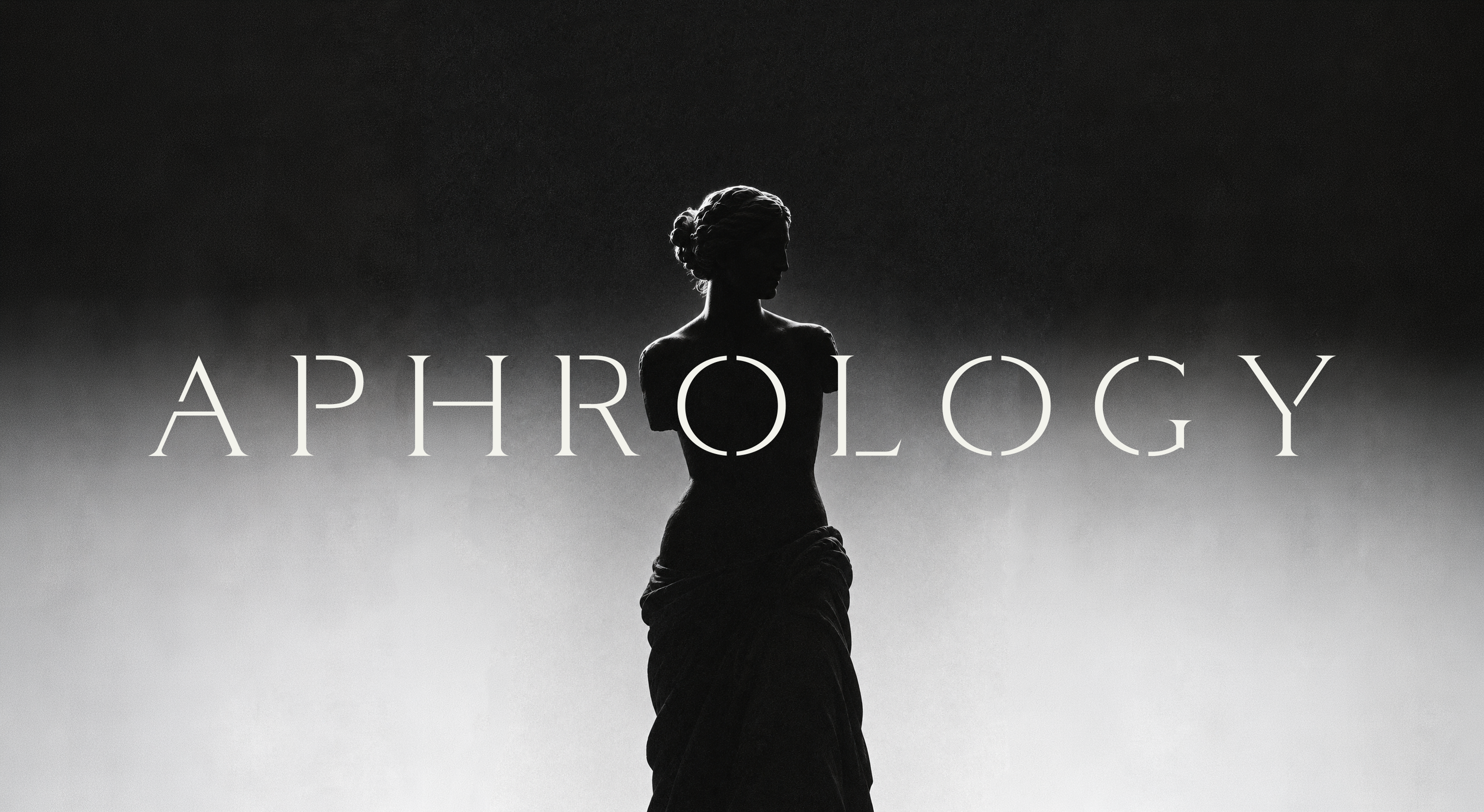
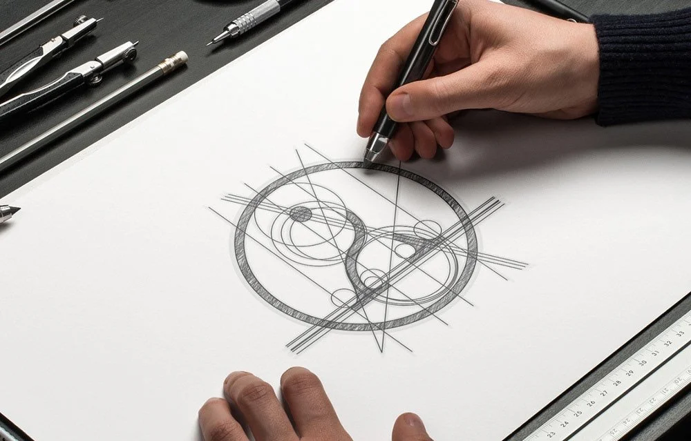
The creative direction explored the relationship between the Aphrology name, Aphrodite and the classical representation of beauty. The Venus de Milo became a central reference, providing a starting point for a visual language built around the human figure, proportion and flowing lines.
The design question was how to translate this reference into a concise symbol that could belong to a contemporary skincare brand. Rather than reproduce the sculpture literally, the concept focused on the relationship between its silhouette and the initial letter of Aphrology.
This connection gave the identity a clear organising idea: the name and symbol would reinforce one another. The resulting approach to beauty branding brings cultural meaning into a simple visual form, giving the brand a story rooted in its own name.
The balance between softness and structure was equally important. Curved lines introduce a sense of beauty and care, while a controlled construction supports the professionalism expected of a science-led company.
The Logo & The Outcome
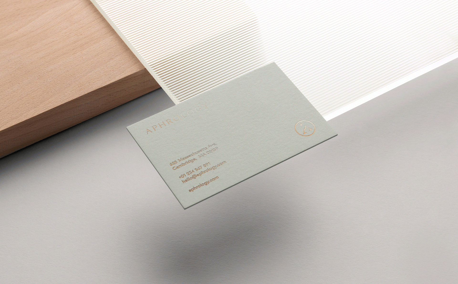
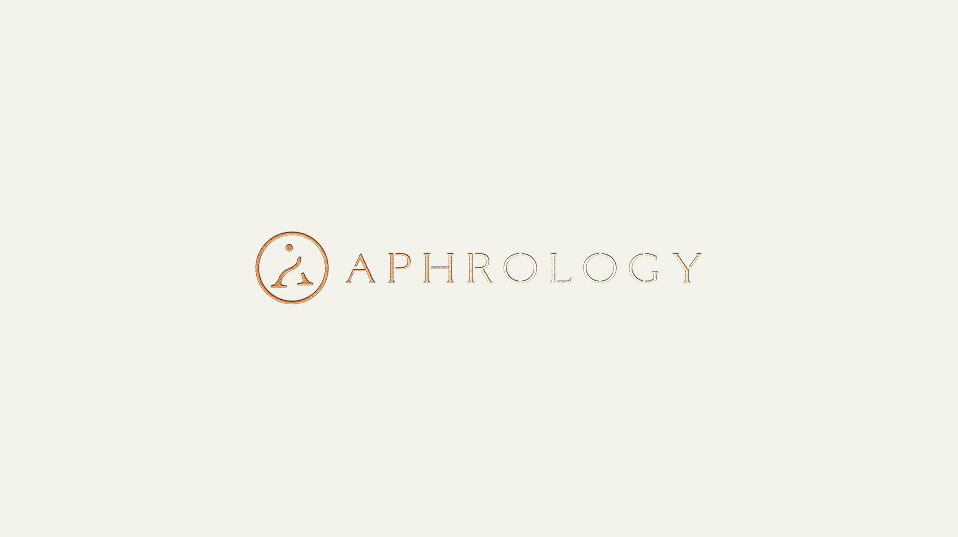
The Aphrology logo combines a monogram and a pictogram in a single mark. Inspired by the Venus de Milo, the symbol brings together the letter A and the suggestion of Aphrodite, creating a direct connection between the brand’s name and its expression of beauty.
Sinuous lines introduce elegance and a human dimension, while the structured form conveys professionalism and authority. This balance gives the skincare brand identity a distinctive foundation, connecting its scientific positioning with a timeless cultural reference.
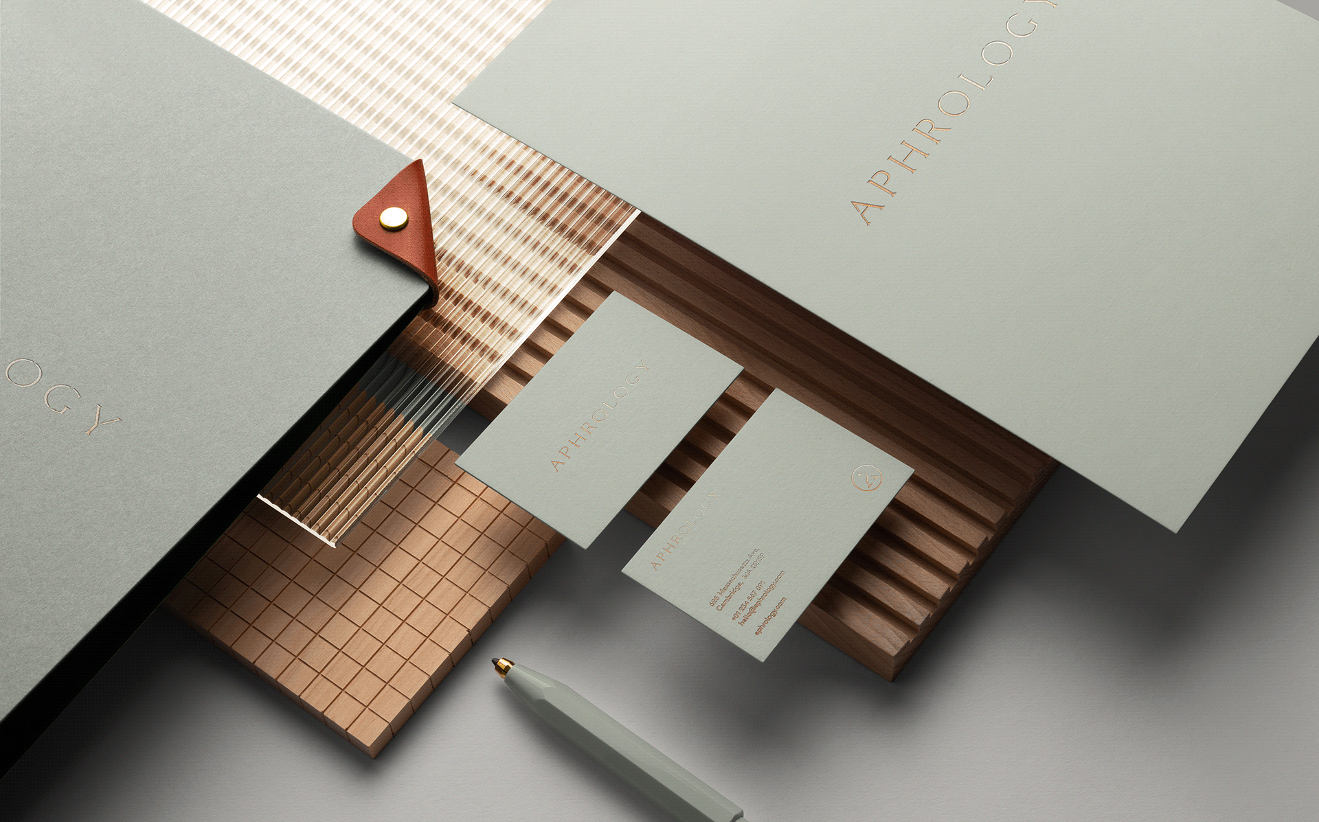
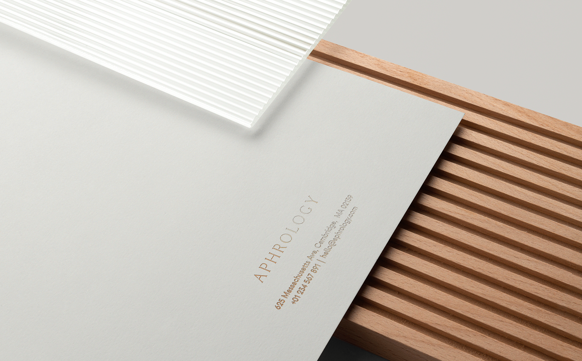
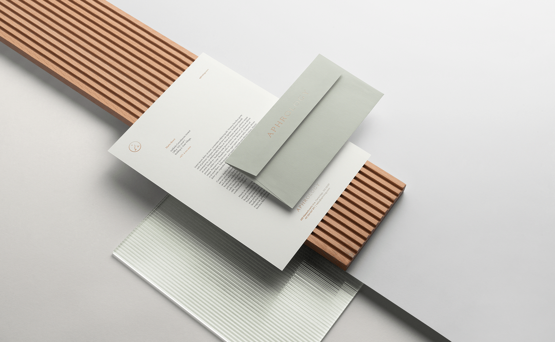
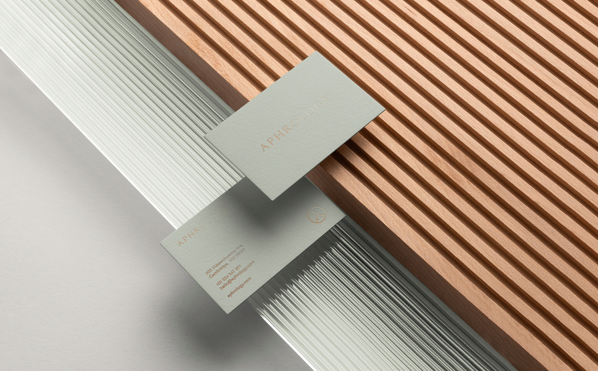
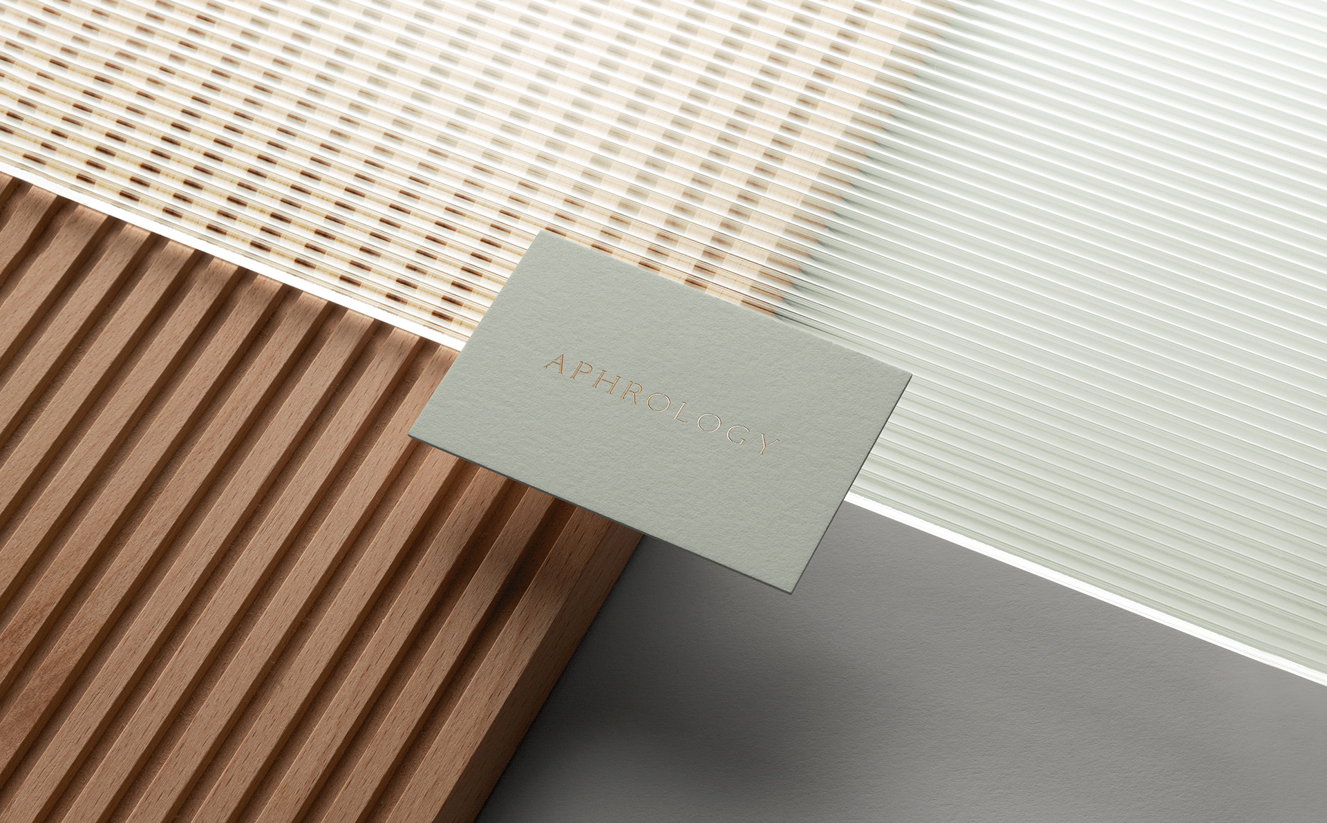
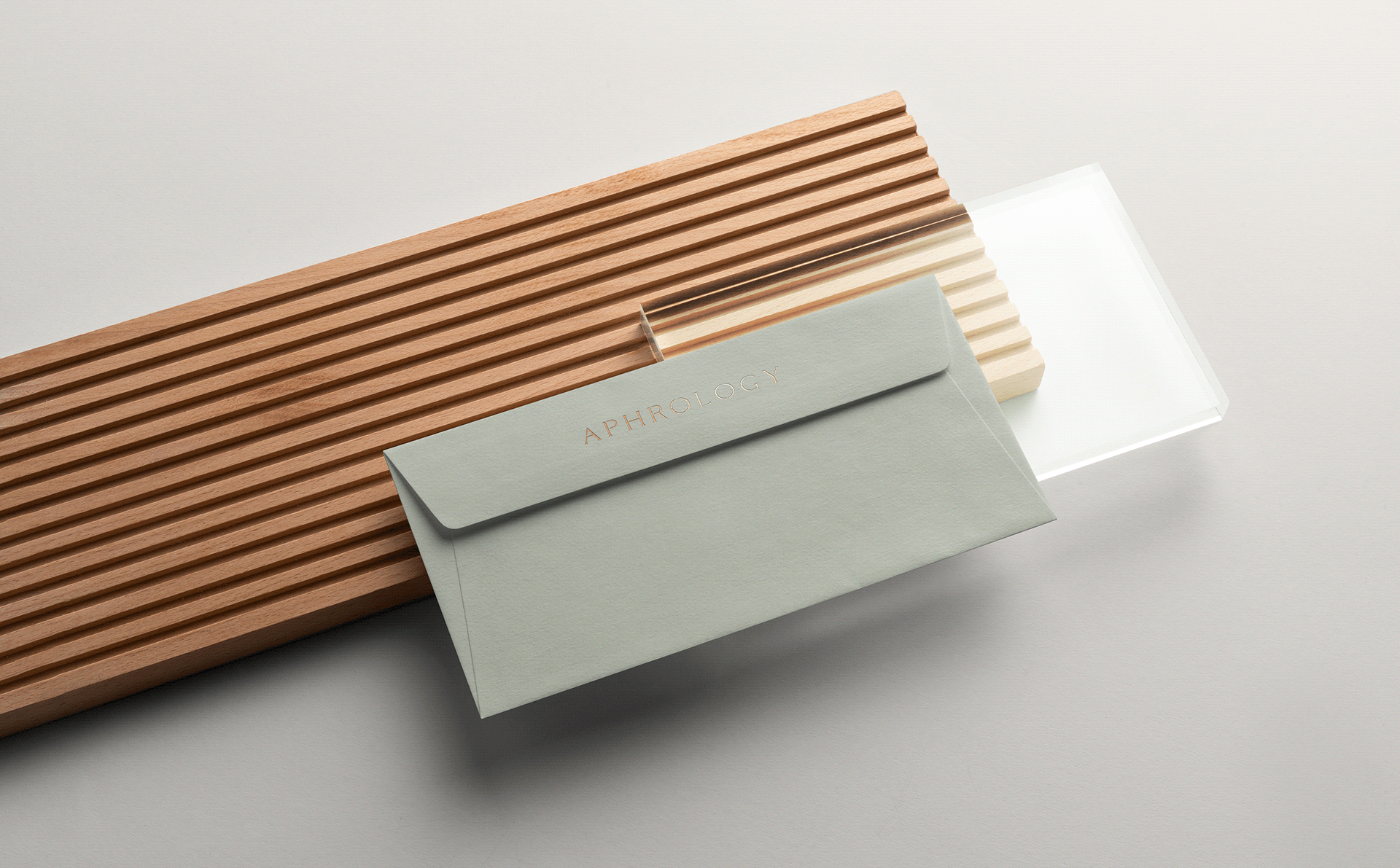
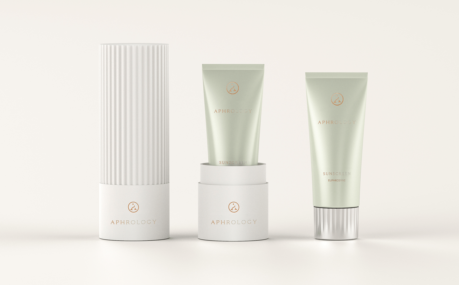
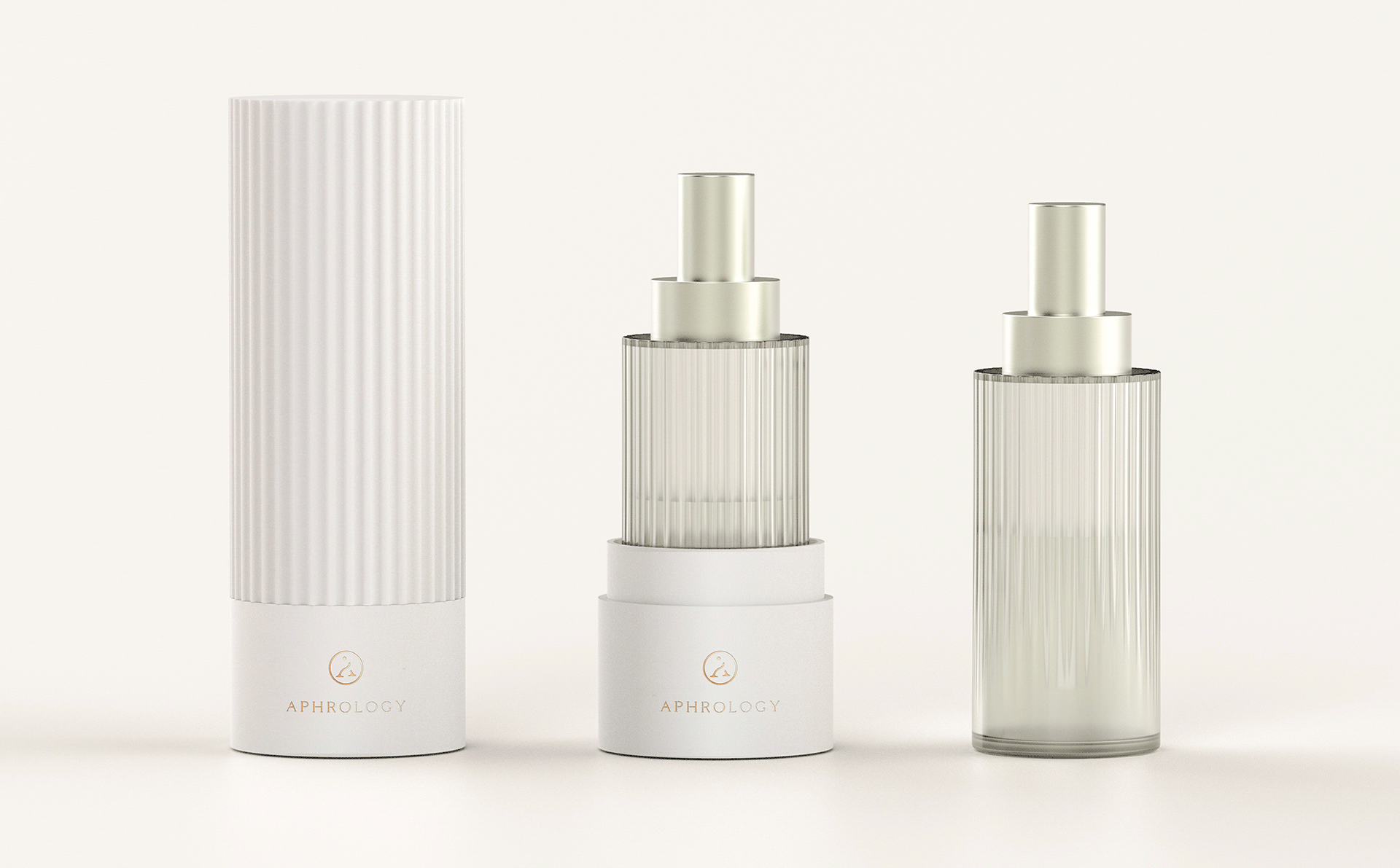
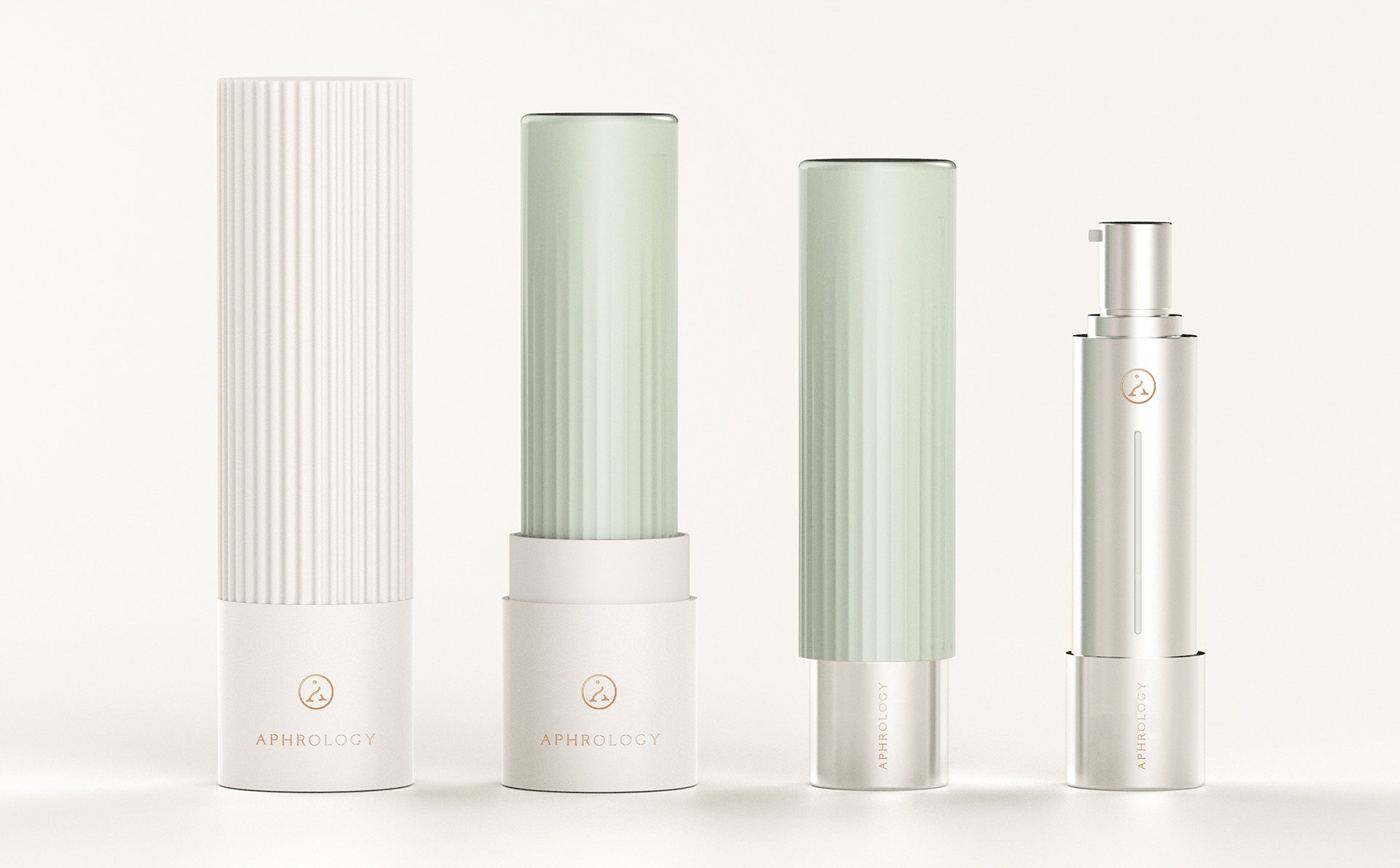
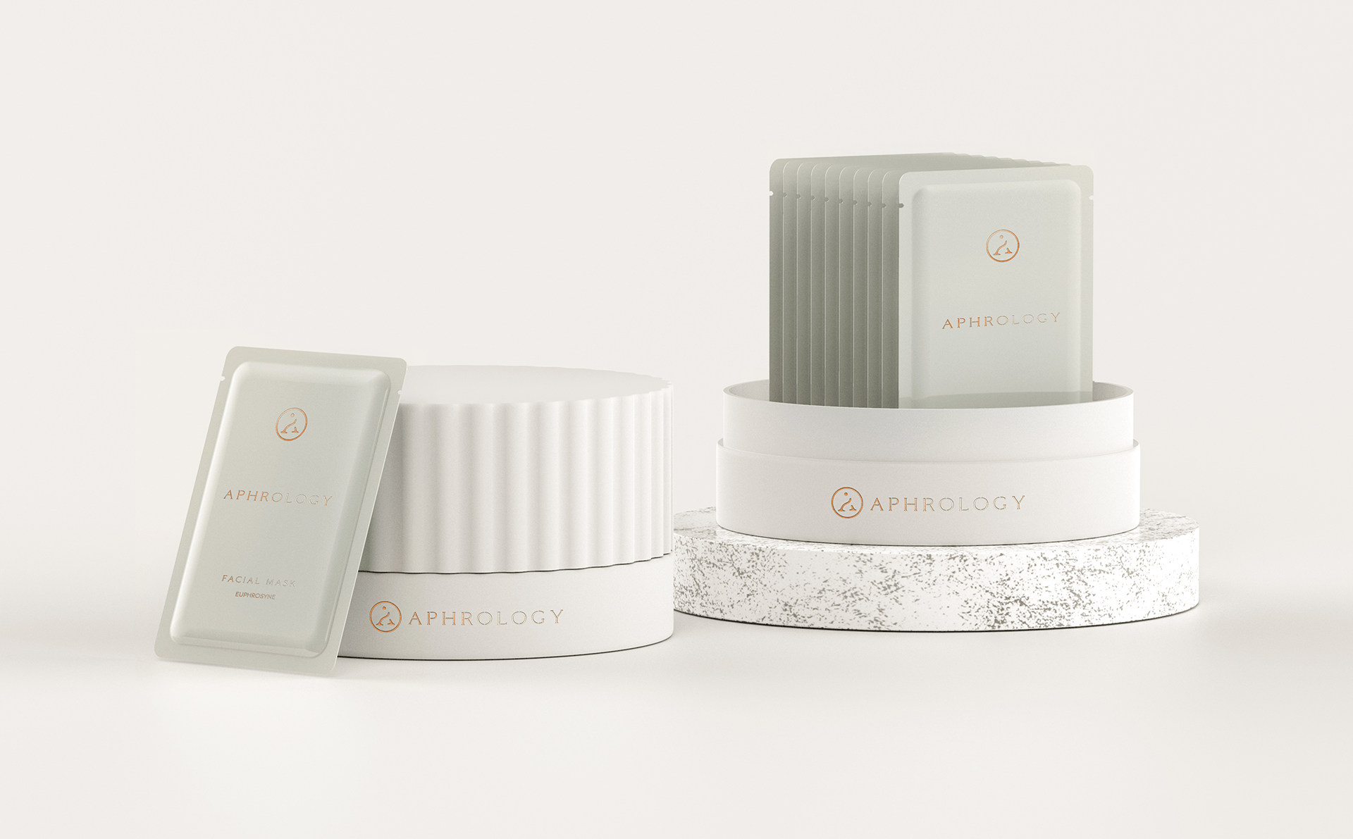
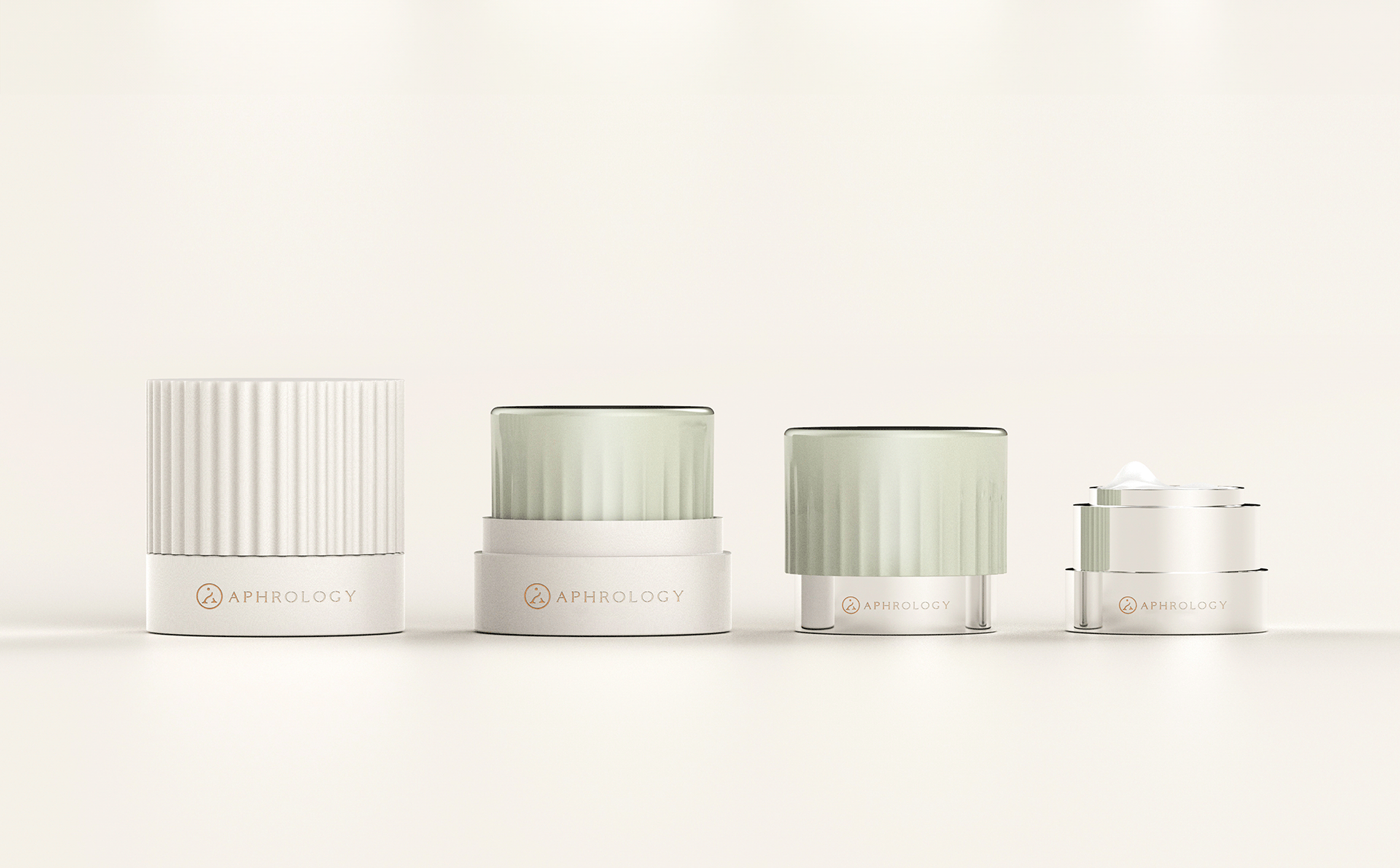
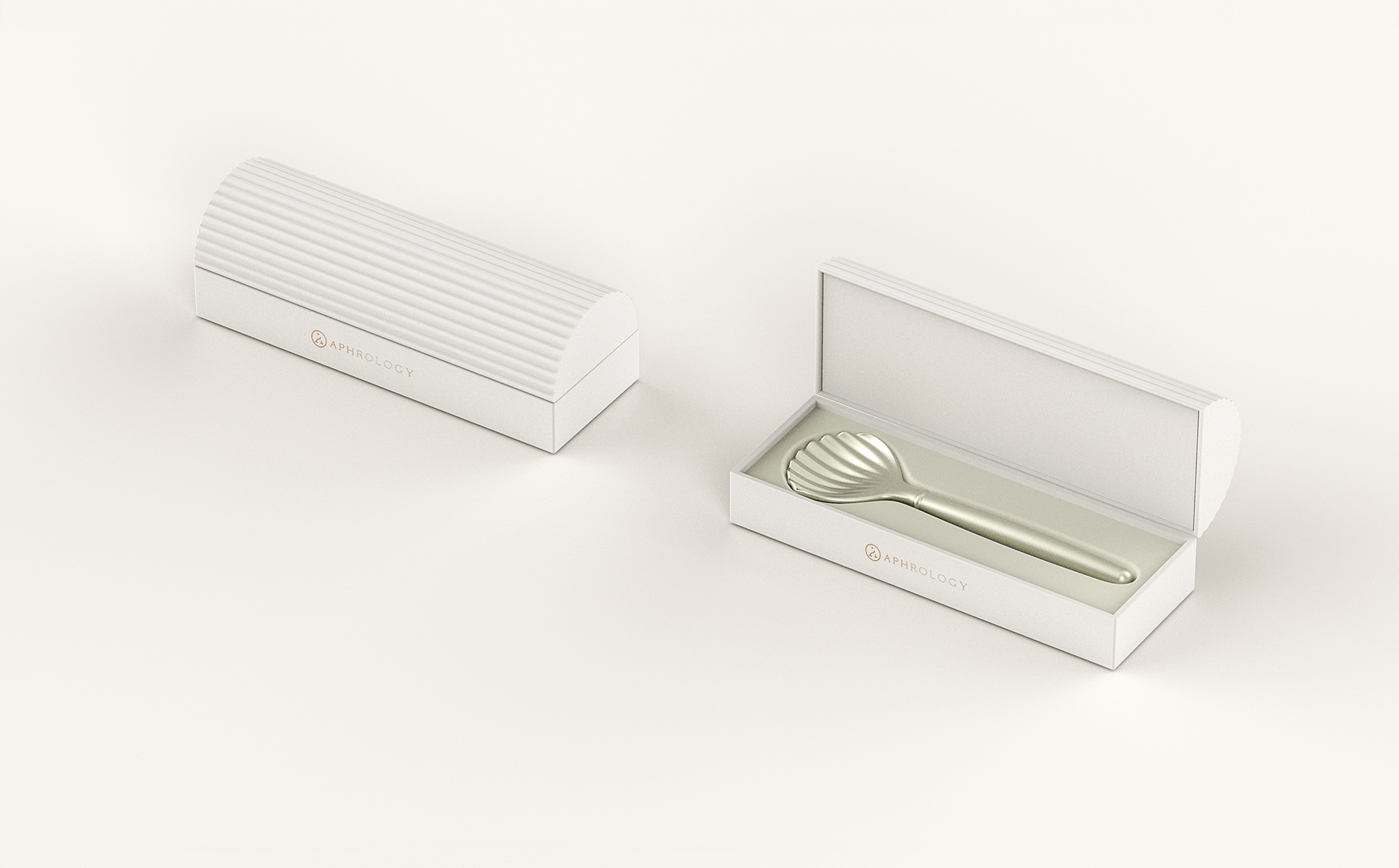
Extended across the visual identity and print materials, the logo establishes a coherent language for the brand’s communication. Its value lies in the relationship between name, form and meaning: each element reinforces the same idea, giving Aphrology a visual story that is both relevant to its business and recognisably its own.
For Elle Visual, the project demonstrates how concept-led logo design can translate a complex beauty proposition into a clear and meaningful brand identity.