BLN24
Brand Identity
Client Overview
BLN24 Studio is a creative agency specializing in media production, advertising, design, and brand strategy. Driven by a genuine passion for storytelling and creativity, the studio brings together different disciplines to create meaningful experiences and compelling visual communications.
Its philosophy is rooted in a simple belief: every story deserves to be told, but not every storyteller is created equal.
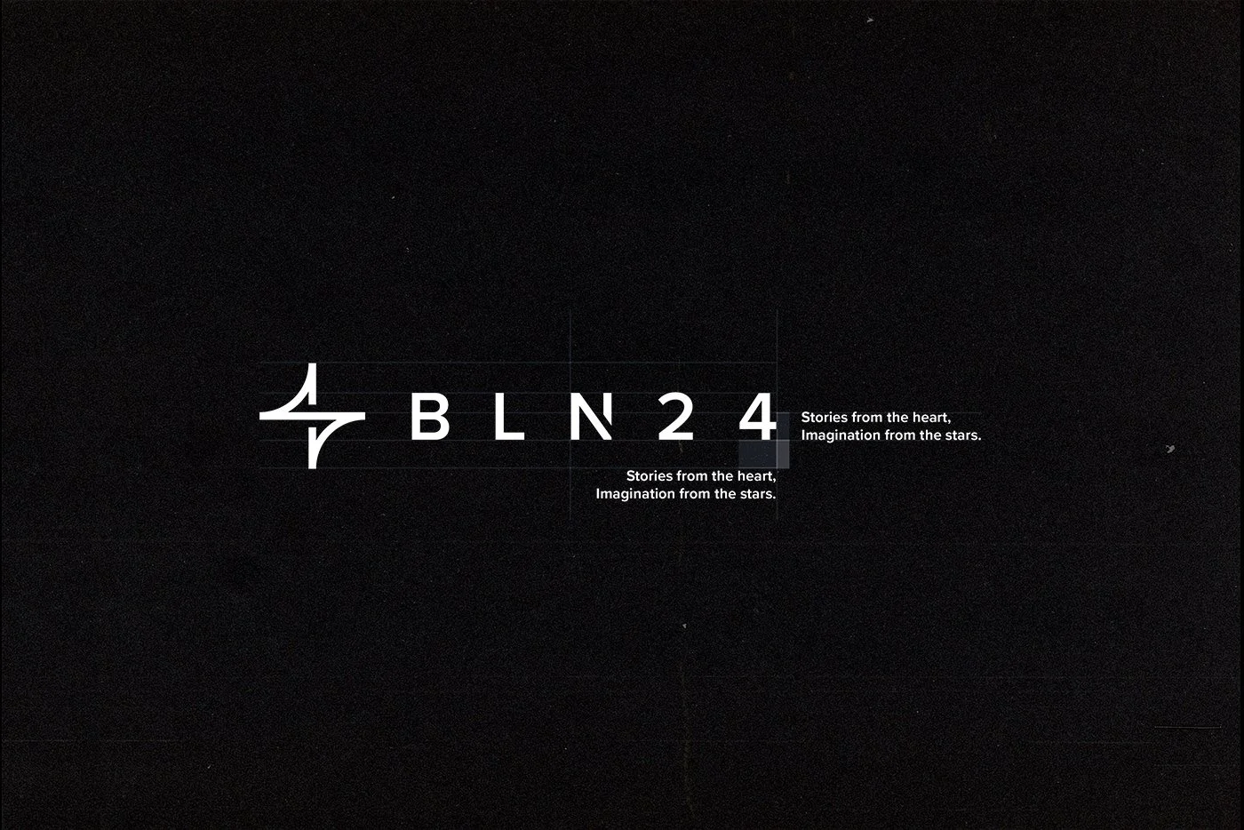
The name BLN24 reflects the team's continuous dedication to its craft, expressing a creative mindset that goes beyond conventional working hours. This commitment is captured in the studio's distinctive statement: “Stories from the heart, imagination from the stars.”
The challenge was to develop a bold, recognizable, and timeless brand identity capable of representing the agency's creative personality, multidisciplinary expertise, and dedication to excellence.
The visual identity needed to communicate professionalism and confidence while remaining distinctive enough to stand out within the competitive creative industry.
Scope
Brand Identity, Logo Design, Print Materials.
Why Elle Visual
Our creative approach began by identifying the defining characteristic of BLN24: a passion for creativity that never stops.
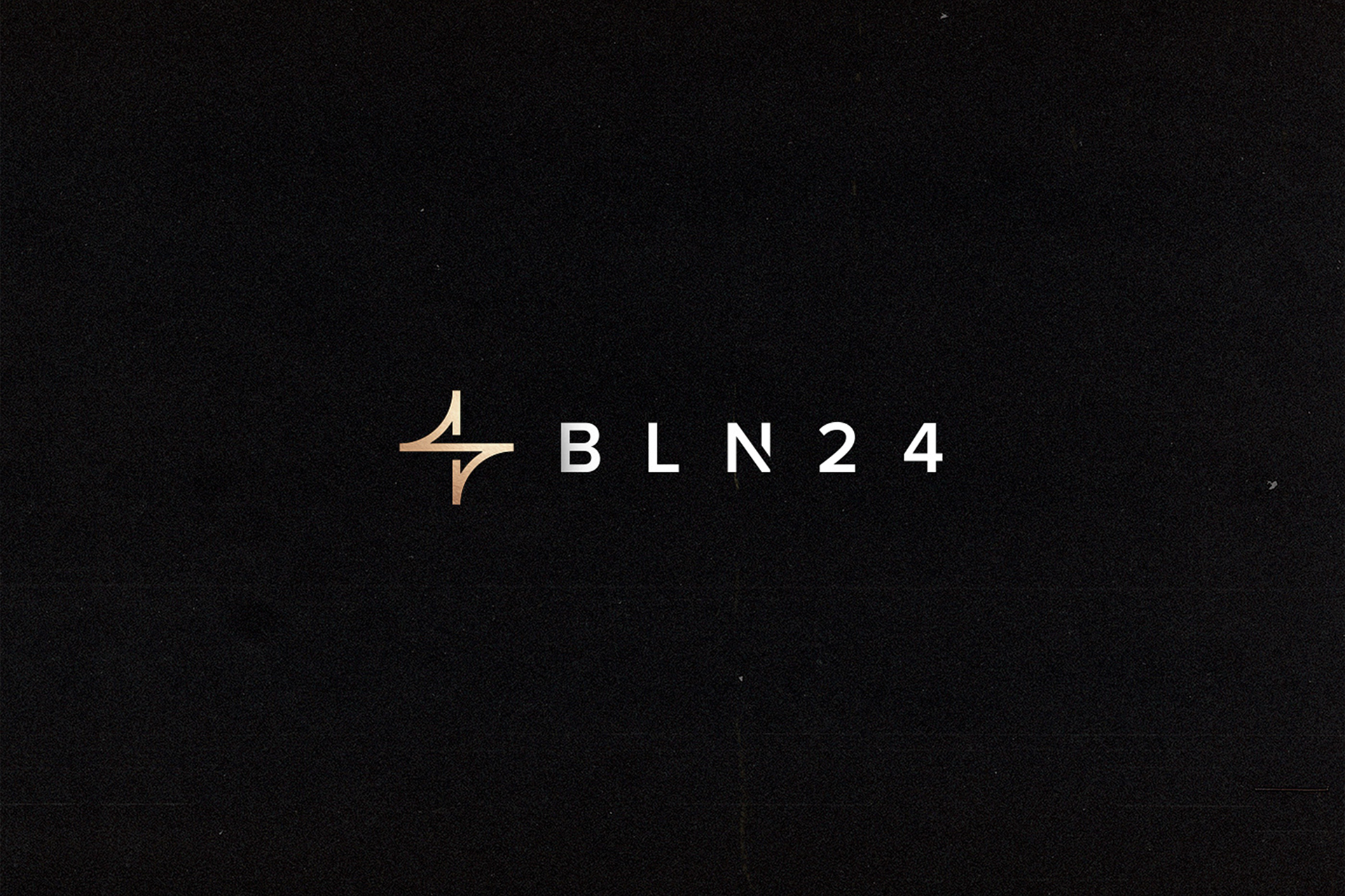
Rather than relying on predictable symbols associated with advertising and media production, we explored the company's name itself, transforming its numerical identity into a meaningful and recognizable visual element.
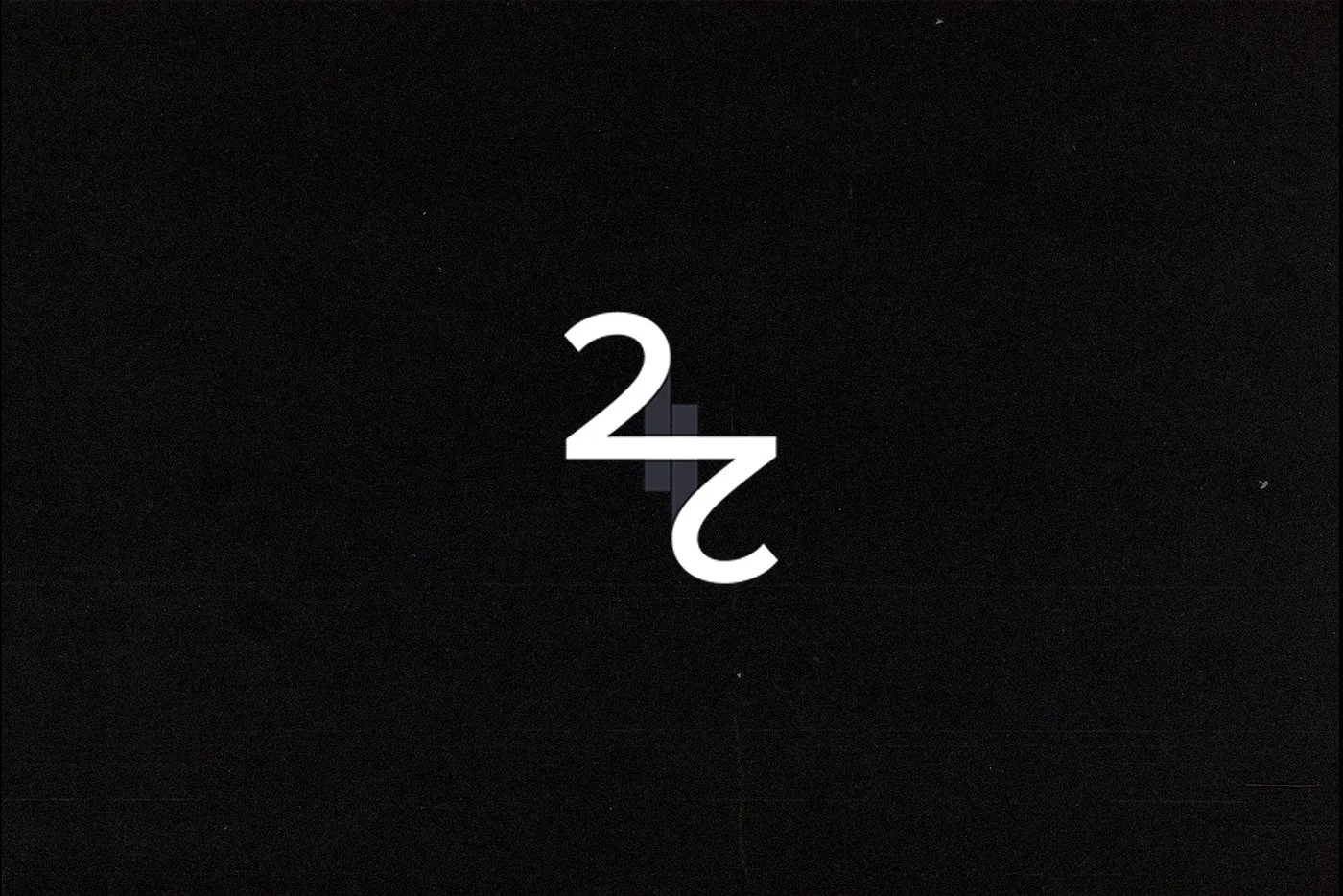
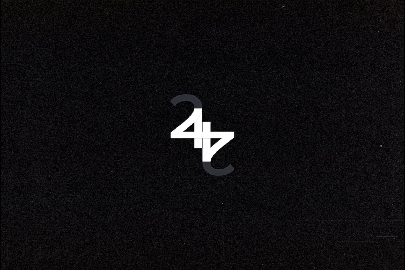
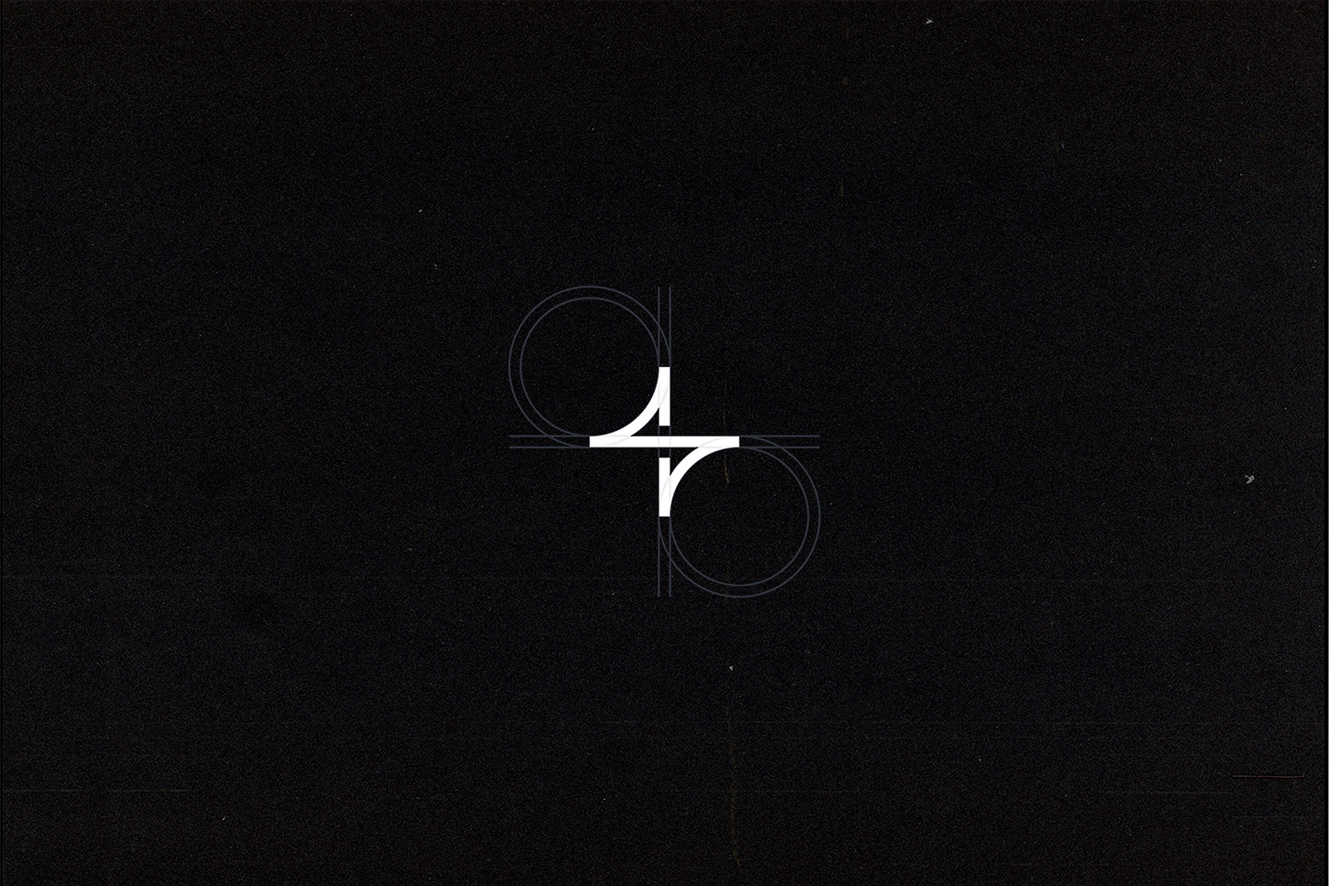
The logo concept emerged from the combination of the numbers 2 and 4, carefully integrated into a single geometric symbol. This construction creates a distinctive monogram that visually reinforces the company's identity and its commitment to creativity, 24 hours a day.
The relationship between the two numbers was refined through proportion, balance, and negative space, allowing the symbol to communicate a strong personality while maintaining a clean and minimal appearance.
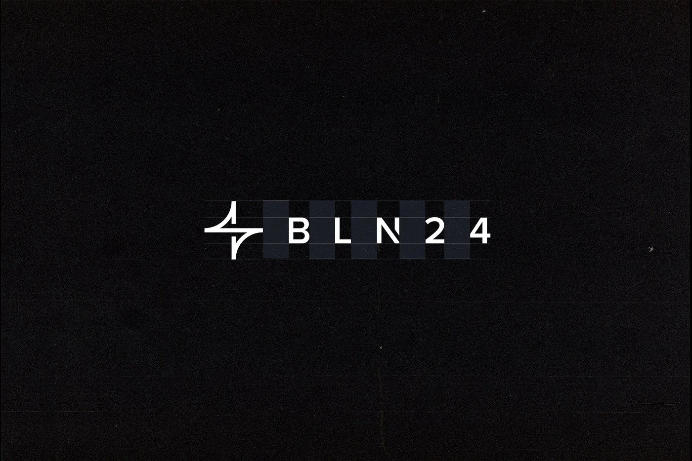
A contemporary typographic approach complements the pictogram, establishing a clear visual hierarchy and creating a cohesive relationship between the symbol and the BLN24 logotype.
The high-contrast monochromatic palette reinforces the identity's confident and sophisticated character. By reducing the visual language to its essential elements, we ensured that the logo could remain recognizable and effective across different scales and applications.
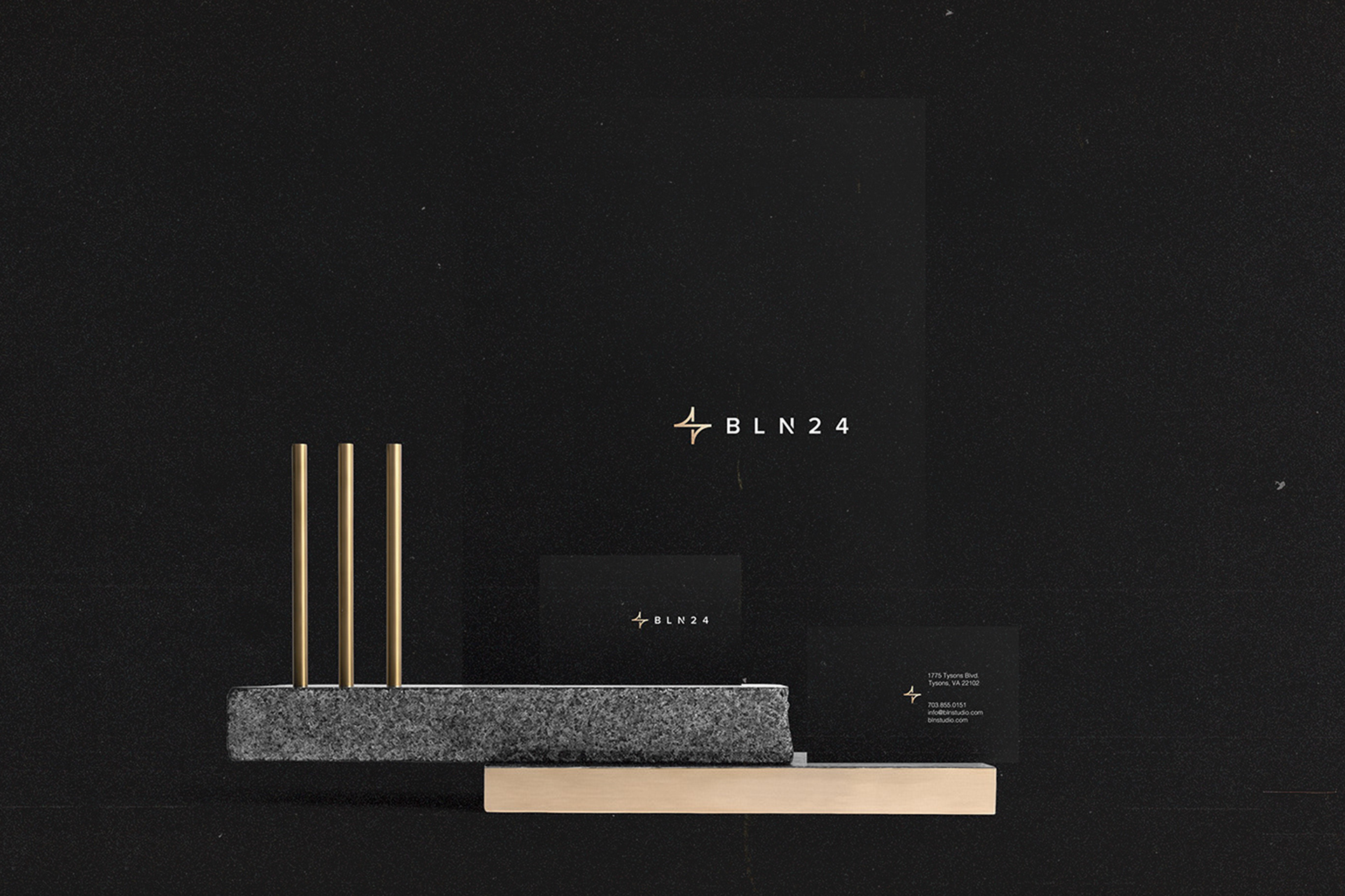
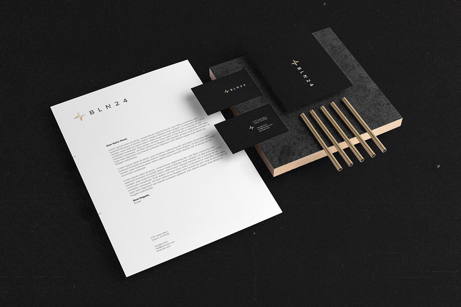
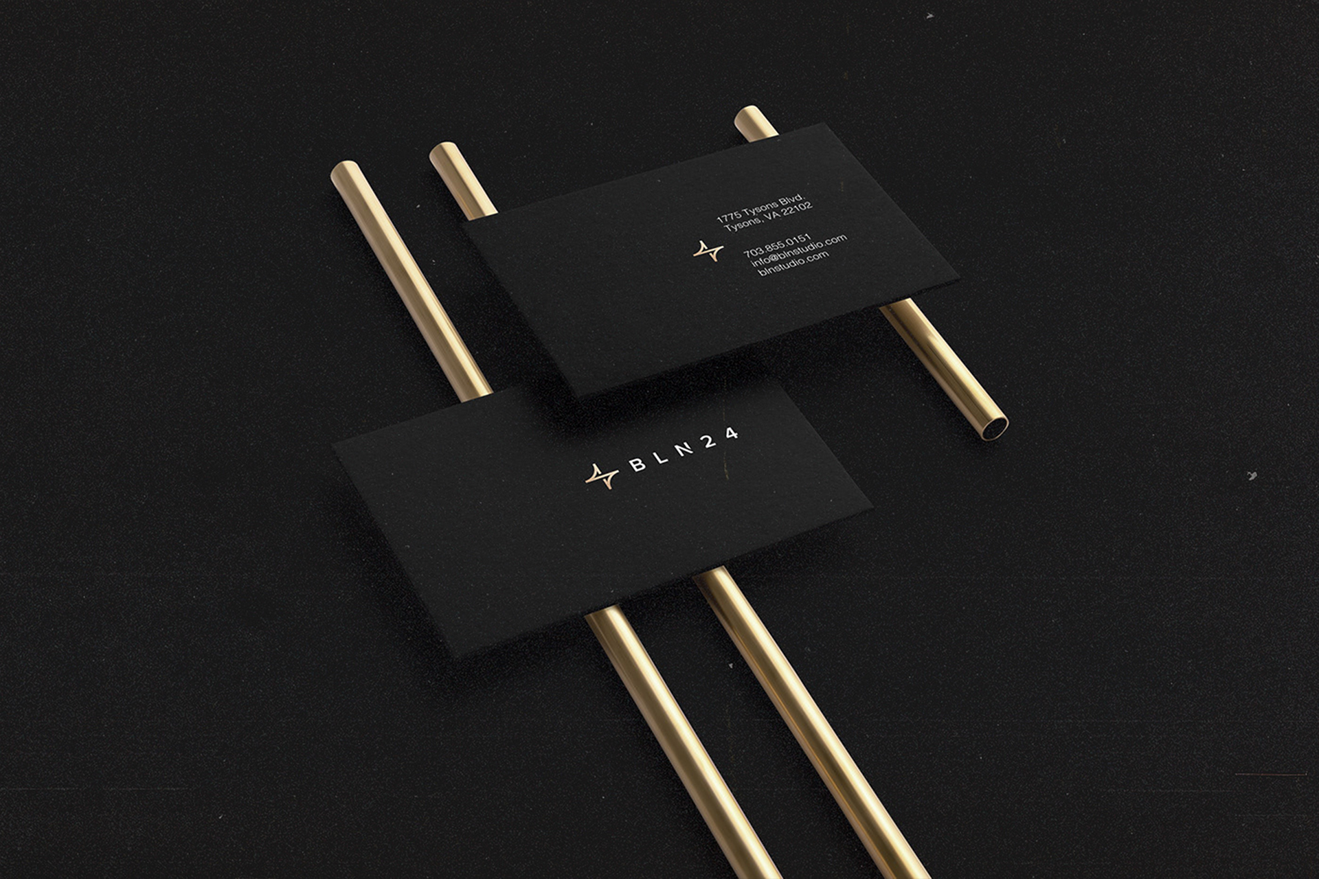
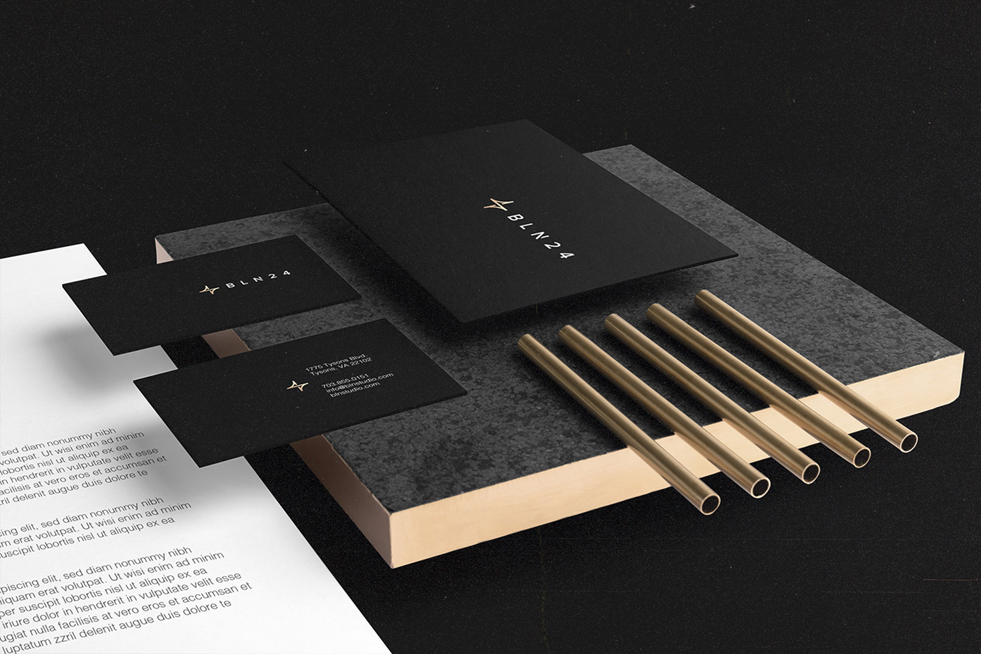
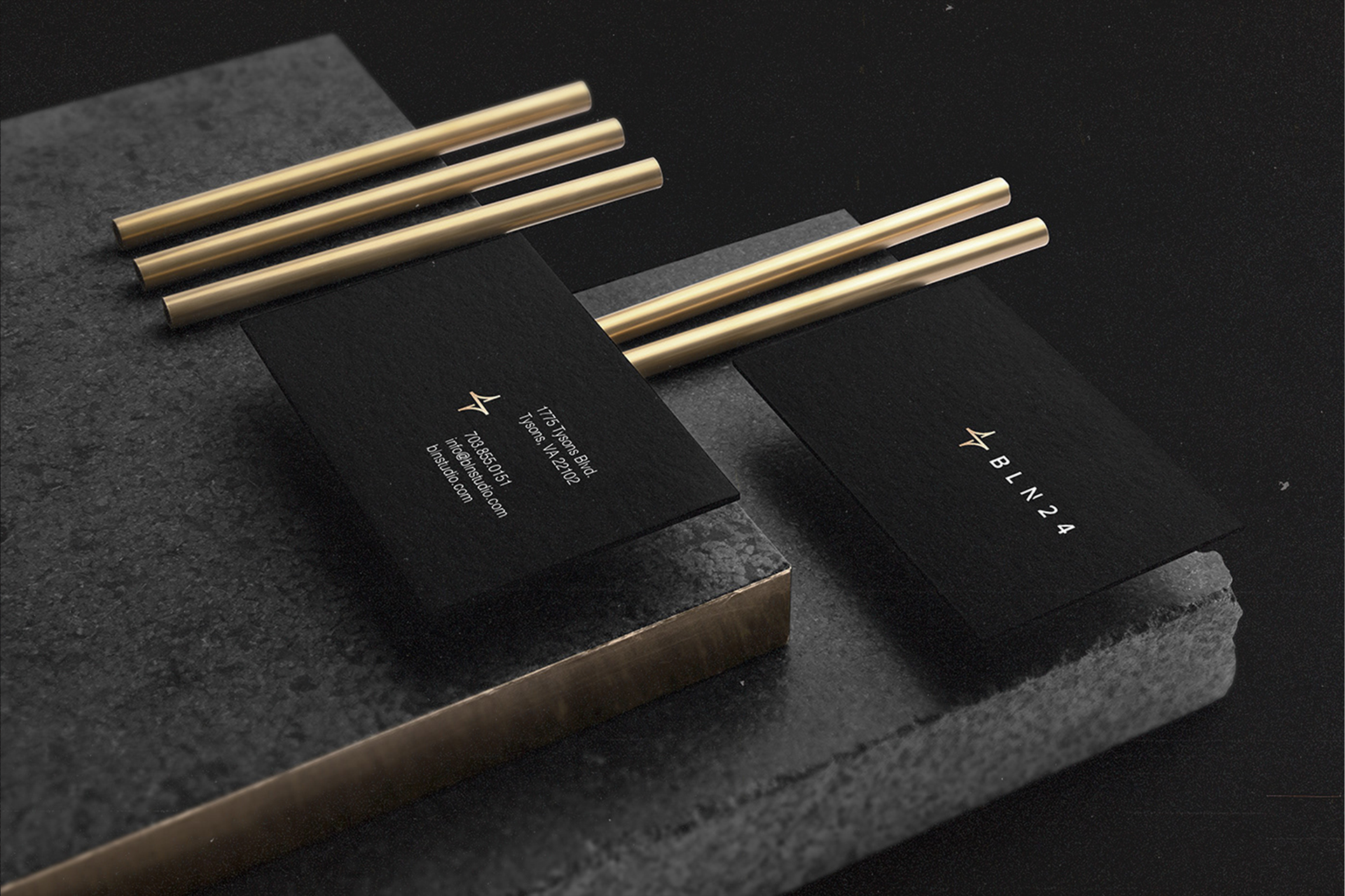
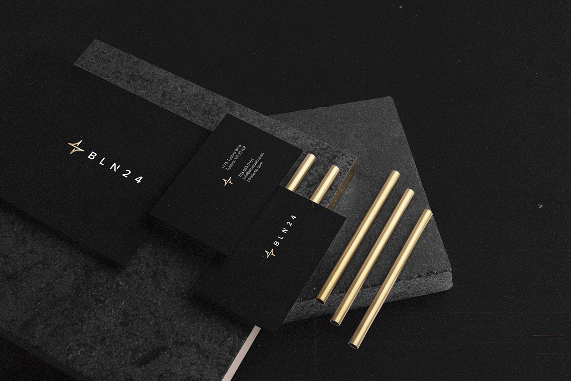
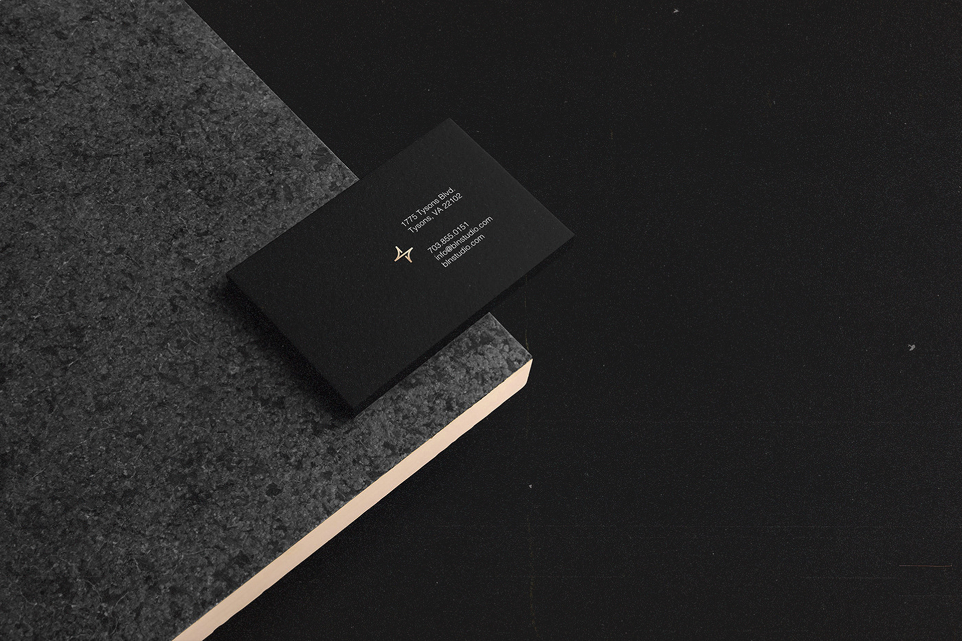
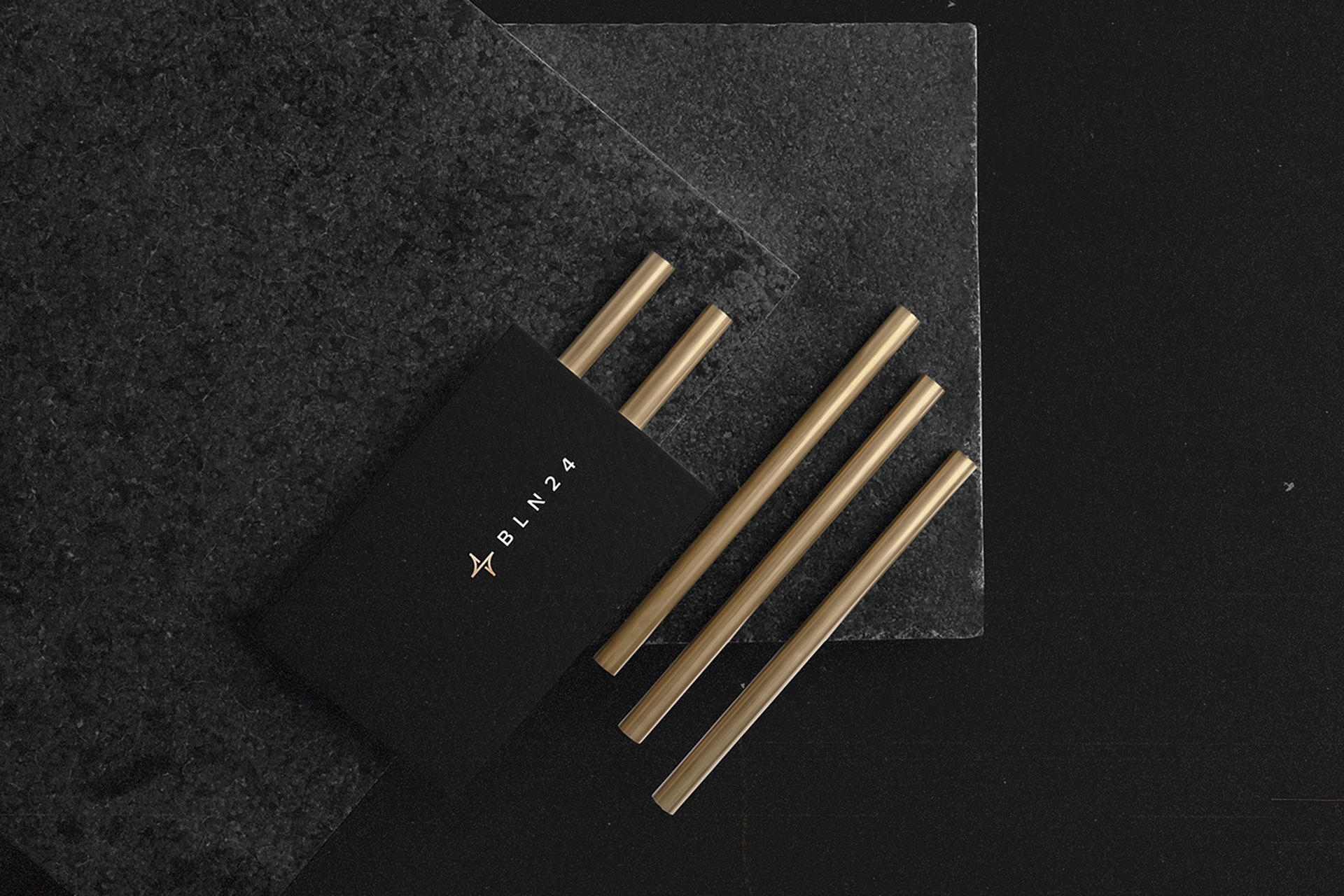
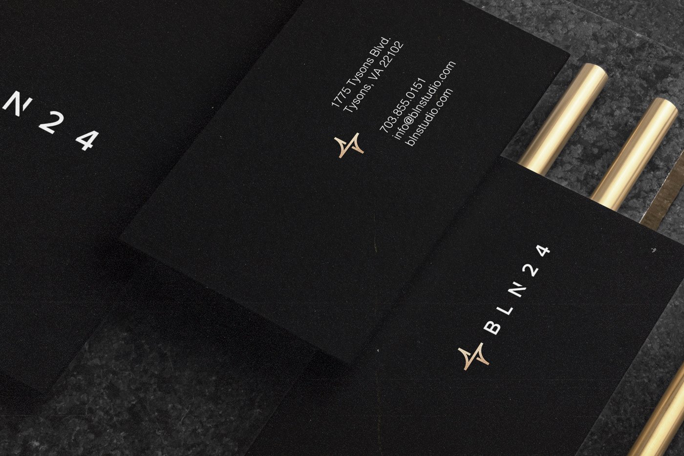
The same design principles were extended to the company's corporate stationery and printed materials, where minimal compositions, carefully considered typography, and refined finishes contribute to a consistent and professional brand experience.
Every element was designed to serve a purpose, creating a visual system that could adapt to the agency's diverse creative activities without losing its distinctive character.
The result is a modern, versatile, and timeless creative agency brand identity that translates BLN24's passion and dedication into a recognizable visual signature.
More than a logo, the identity reflects the studio's fundamental philosophy: creativity is not simply what they do. It is what drives them, every hour of every day.