Insureflow
Brand Identity
Client Overview
Insureflow is a cloud-hosted insurance technology platform that brings product development, distribution, underwriting and administration into one configurable solution. Founded in 2017 in response to longstanding frustrations with insurance software, the company helps businesses build and manage insurance products and schemes through technology designed around their operational needs.
Its proposition combines intelligent functionality with customisation, giving insurance businesses the flexibility to address challenges, support growth and introduce new ways of working.
For Elle Visual, the branding challenge was to translate this complex offering into a clear, meaningful visual concept. The logo needed to express both progress and adaptability: the transition towards better insurance technology, alongside the platform’s ability to accommodate the individual requirements of each business.
Scope
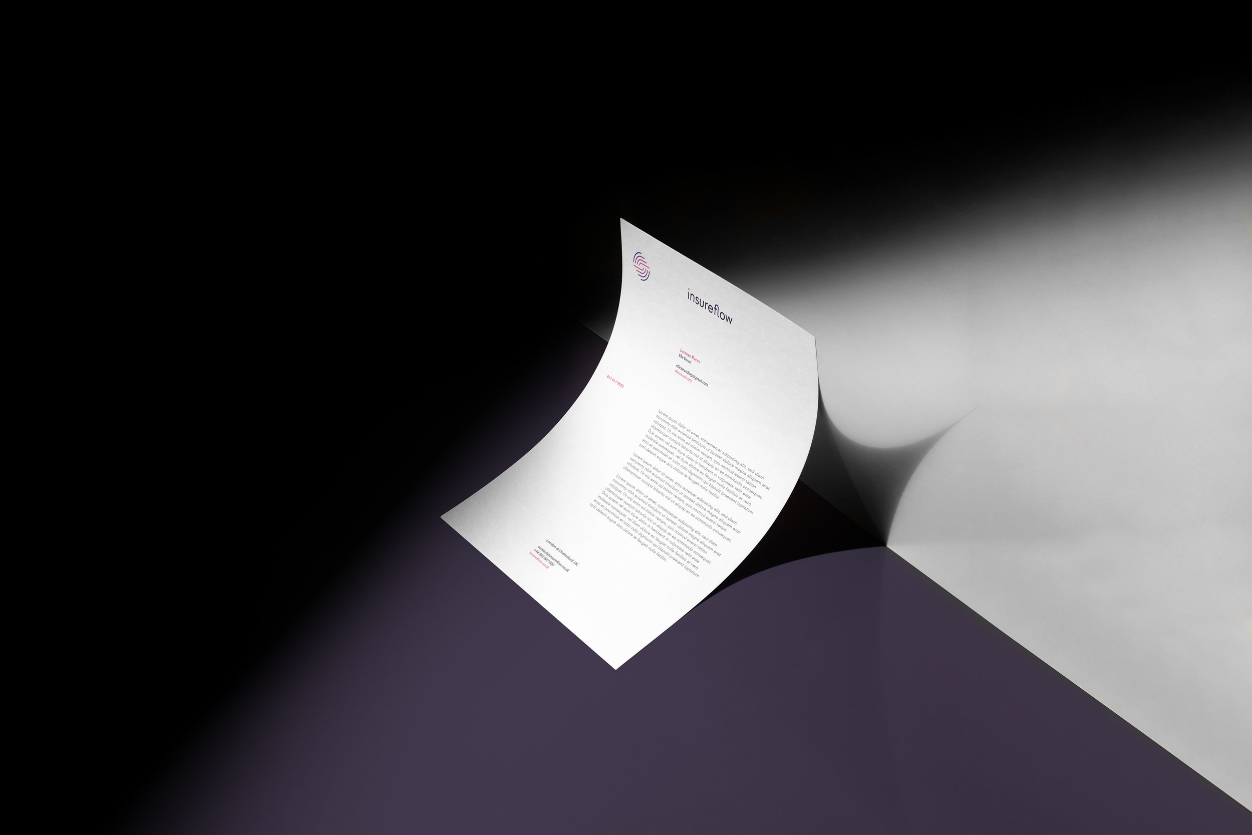
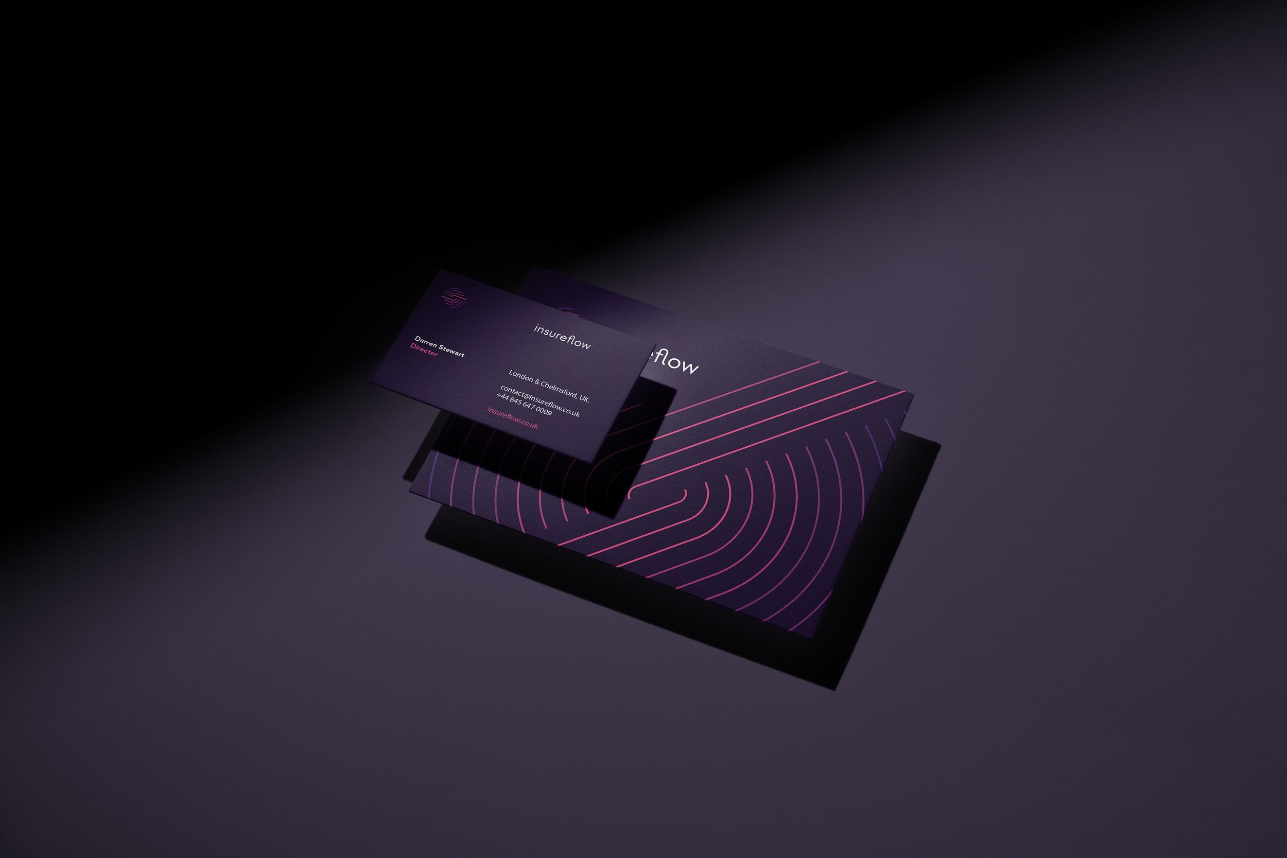
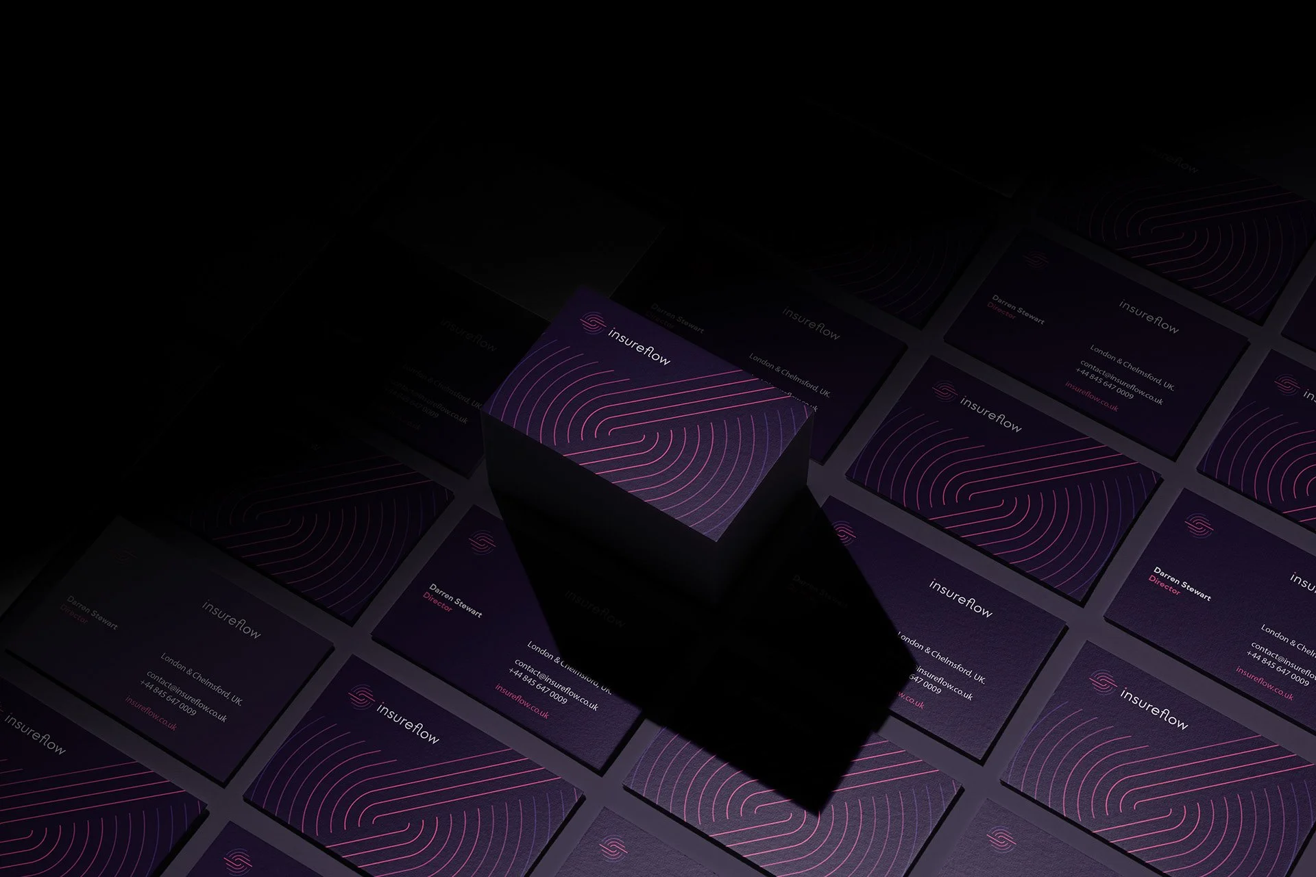
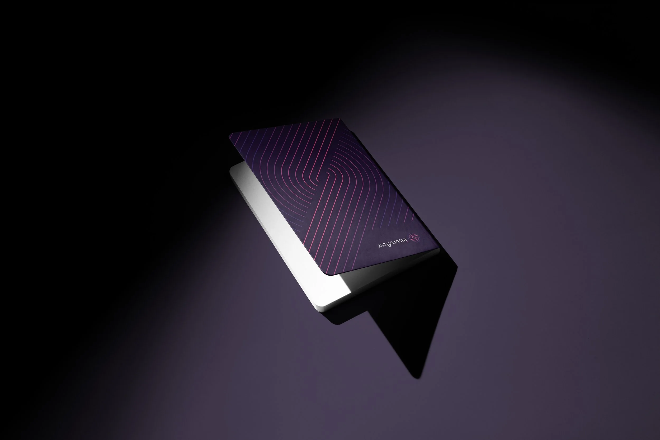
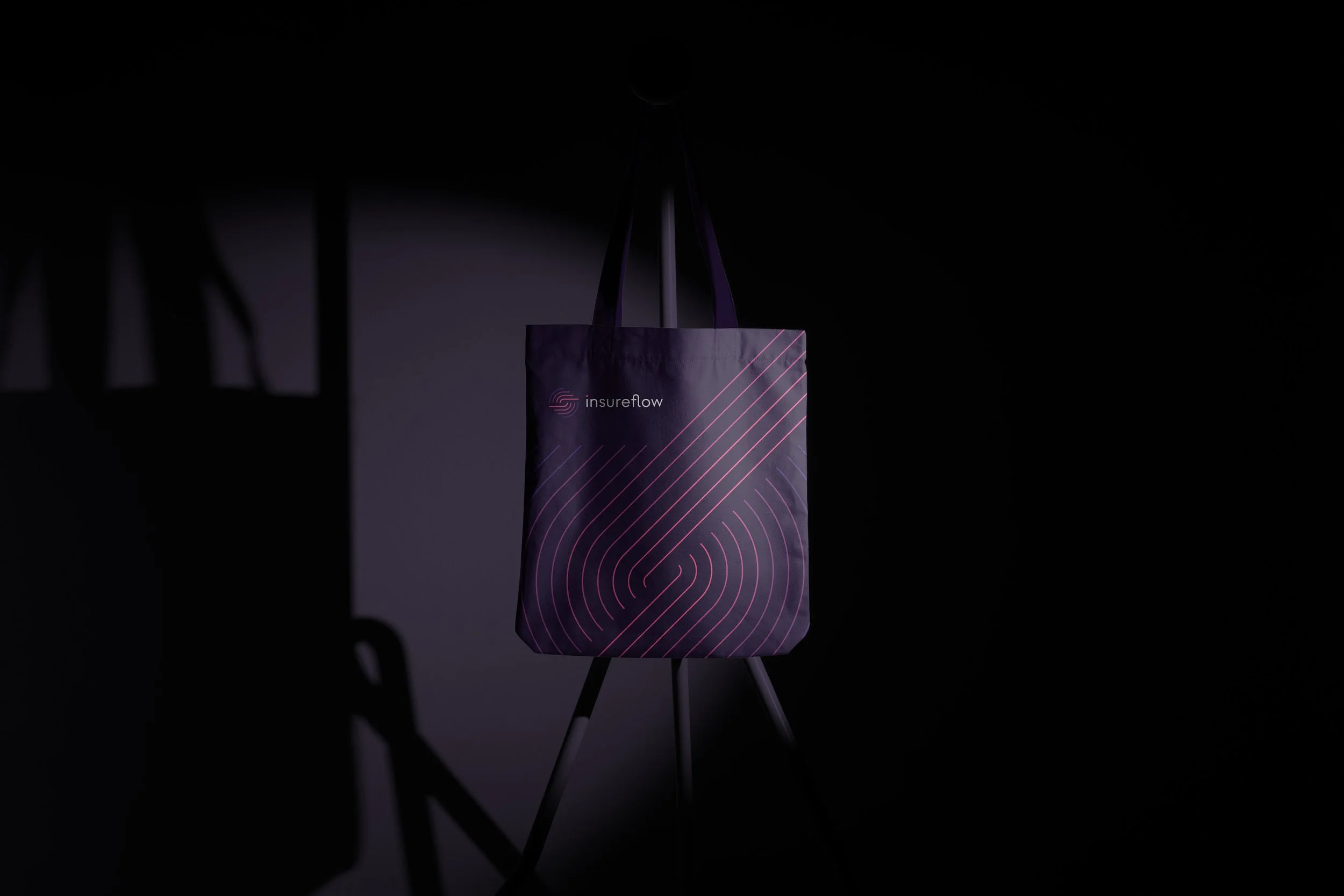
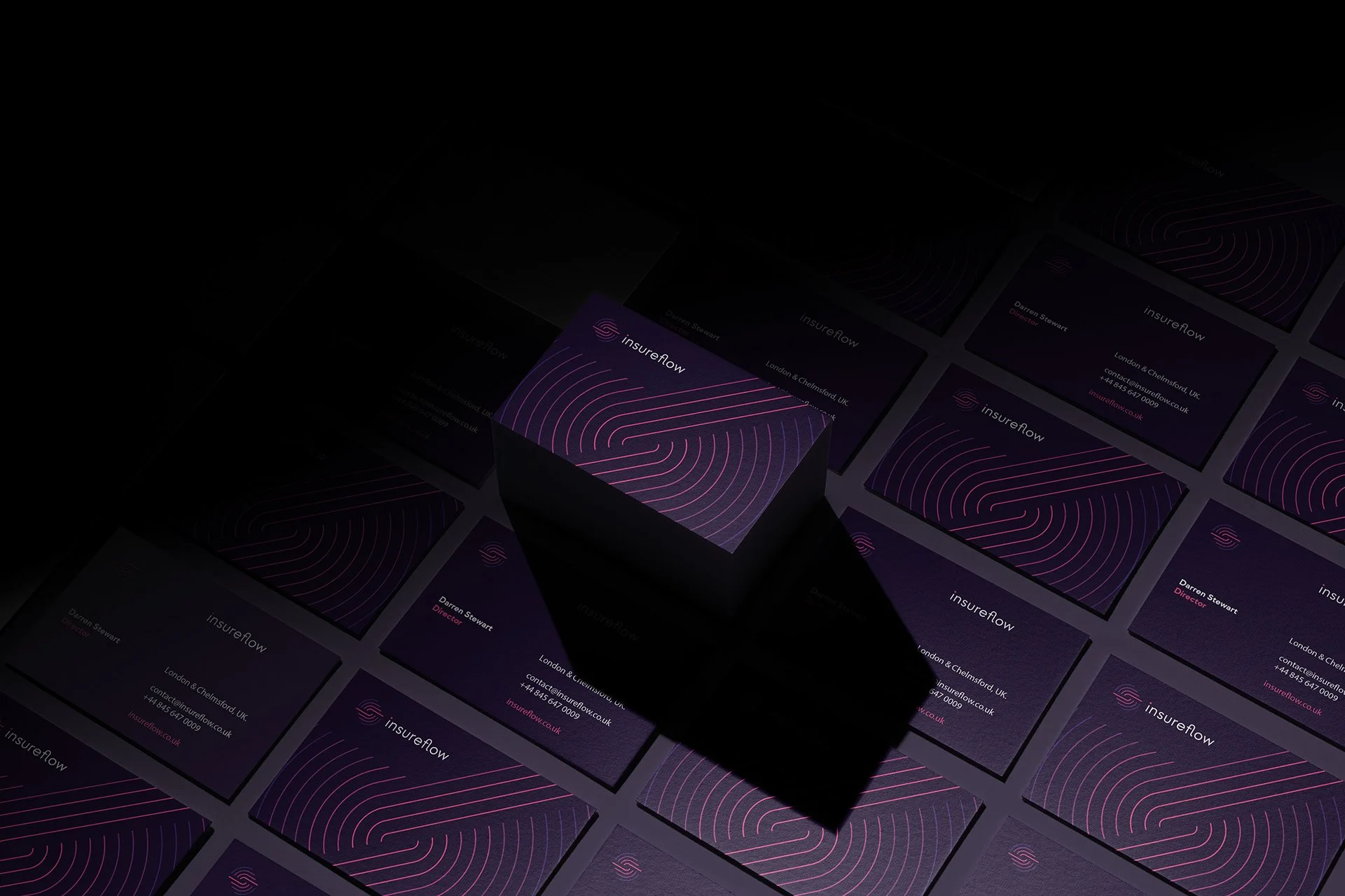
Brand Identity, Logo Design, Print Materials.
Why Elle Visual
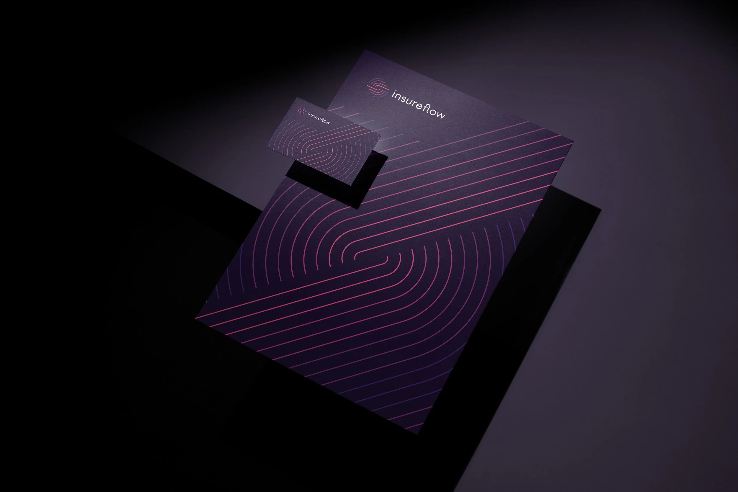
We approached the logo design by connecting Insureflow’s name with two central ideas behind its offering: movement and personalisation. These became the foundation of a concept that gives the brand’s technical capabilities a recognisable visual expression.
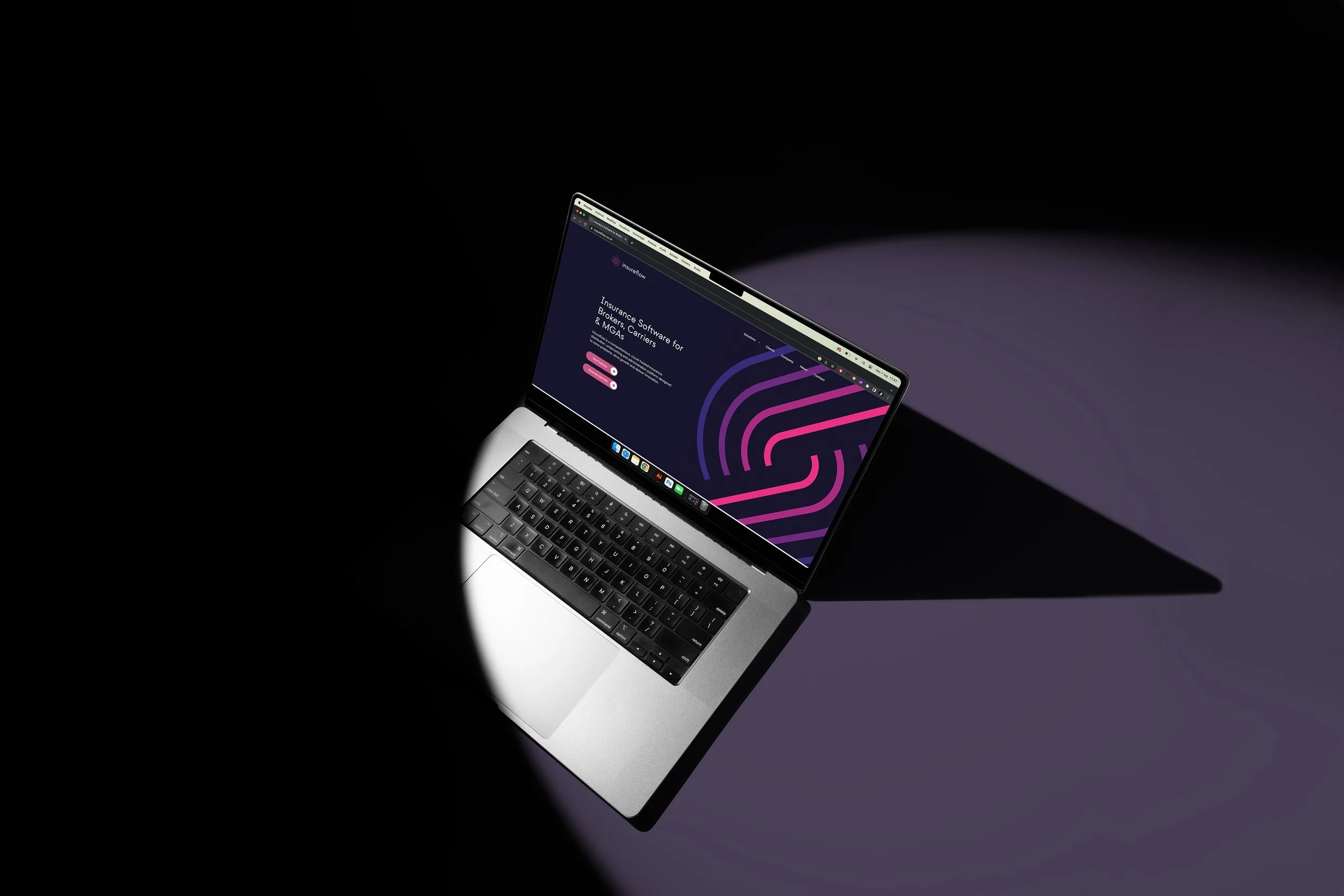
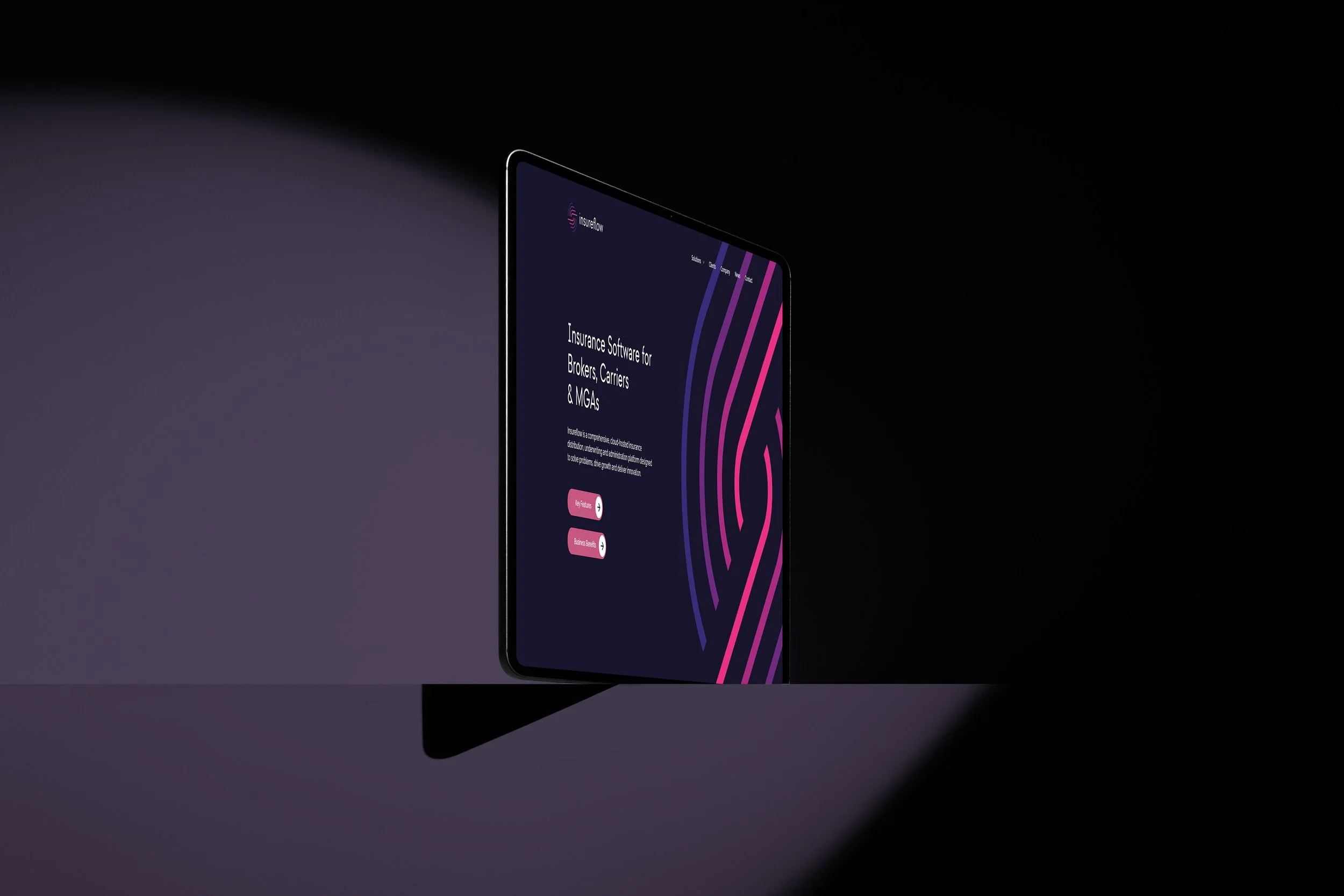
We used lines to represent the relationship between past and future. Their role was to communicate progression, reflecting Insureflow’s ambition to help businesses move beyond the limitations of existing insurance technology and towards more effective ways of operating.
The linear composition also references the idea of flow embedded in the company’s name. It creates a visual connection with a platform that brings together multiple stages of the insurance lifecycle, from building and distributing products to underwriting and administration.
A further layer of meaning emerges through the relationship between the different lines. Together, they suggest a digital fingerprint: a reference to individuality within a technology-driven environment. This detail expresses the platform’s customisable nature, linking the symbol directly to Insureflow’s business proposition.
By bringing these ideas into a single mark, we gave the logo a rationale rooted in what the company does and why it exists. Progress, flow and individuality become connected parts of the same visual story.
The outcome is an insurtech logo that translates a multifaceted platform into a focused brand expression. It gives Insureflow a meaningful symbol for communicating its ambition.