Magna & York
Brand Identity
Client Overview
Magna & York is a New York-based real estate company specializing in the ownership, leasing, and development of multifamily residential properties in Manhattan.
Built on the principles of honesty, integrity, and efficiency, the company approaches real estate with a long-term perspective, placing reliability and trust at the center of every relationship.
The brand's philosophy is captured in a simple yet powerful statement: “Our Word Is Our Bond.” Much like a timeless luxury timepiece, Magna & York aspires to represent precision, elegance, and enduring value.
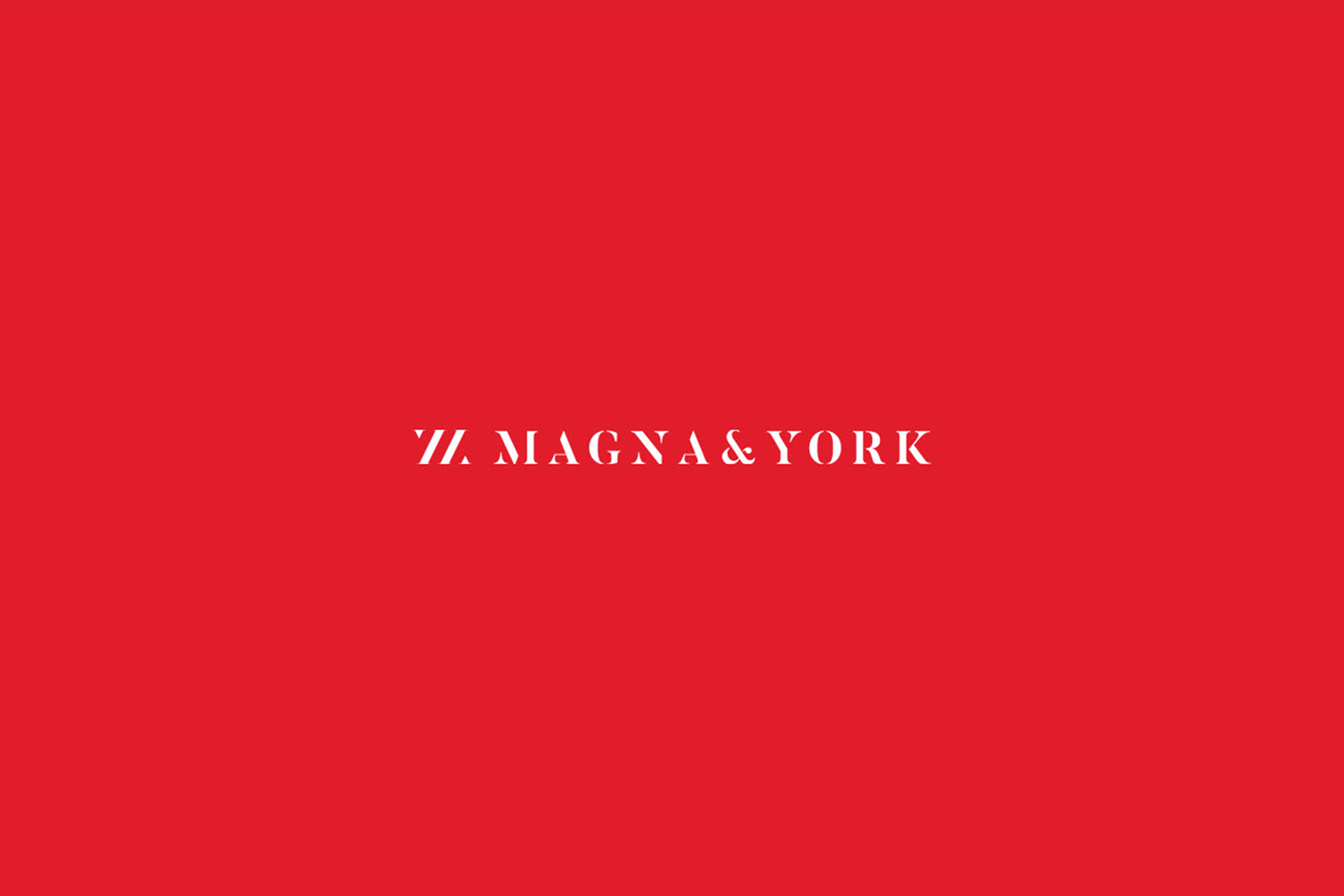
The challenge was to develop a sophisticated and distinctive real estate brand identity that would reflect these principles without relying on the predictable visual conventions of the industry.
The client specifically requested a clean, elegant logo, avoiding decorative elements, architectural symbols, and the overused building imagery commonly associated with New York real estate branding.
Scope
Brand Identity, Logo Design, Print Materials.

Why Elle Visual
Our creative approach began with a fundamental principle: timeless design should never be dictated by temporary trends.
While contemporary branding was increasingly dominated by sans-serif typography, we deliberately explored a different direction, choosing a serif typeface to express the elegance, heritage, and enduring character of Magna & York.
Rather than incorporating conventional real estate symbols, we allowed typography to become the defining element of the brand identity. This decision established a distinctive visual personality, communicating confidence and sophistication through simplicity.
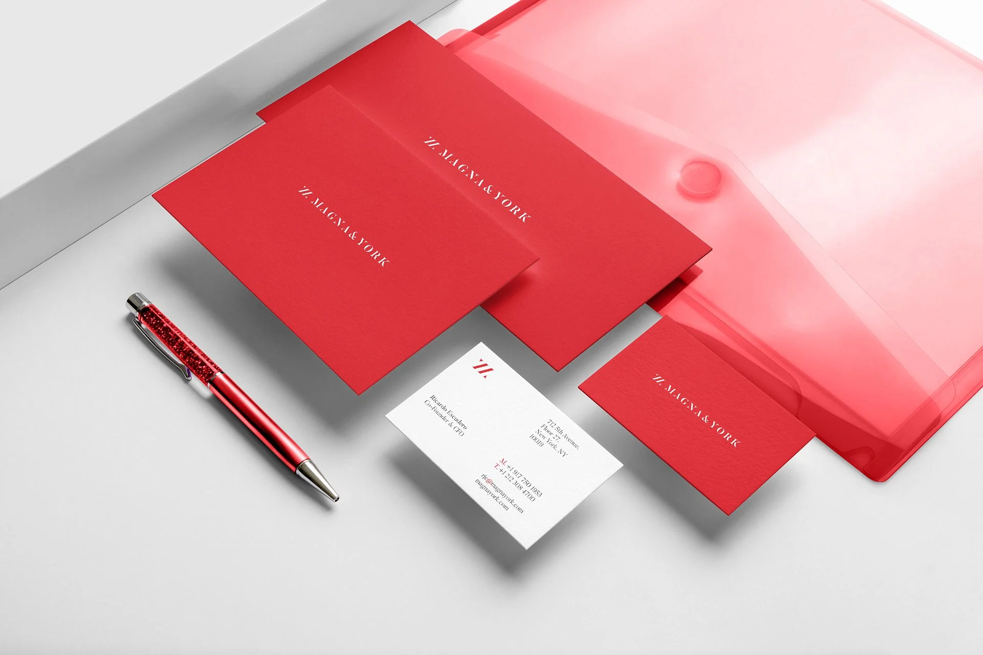
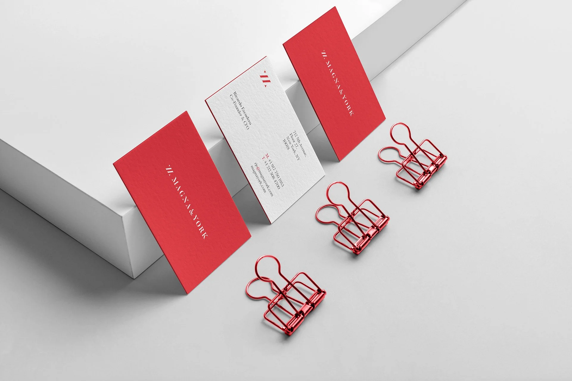
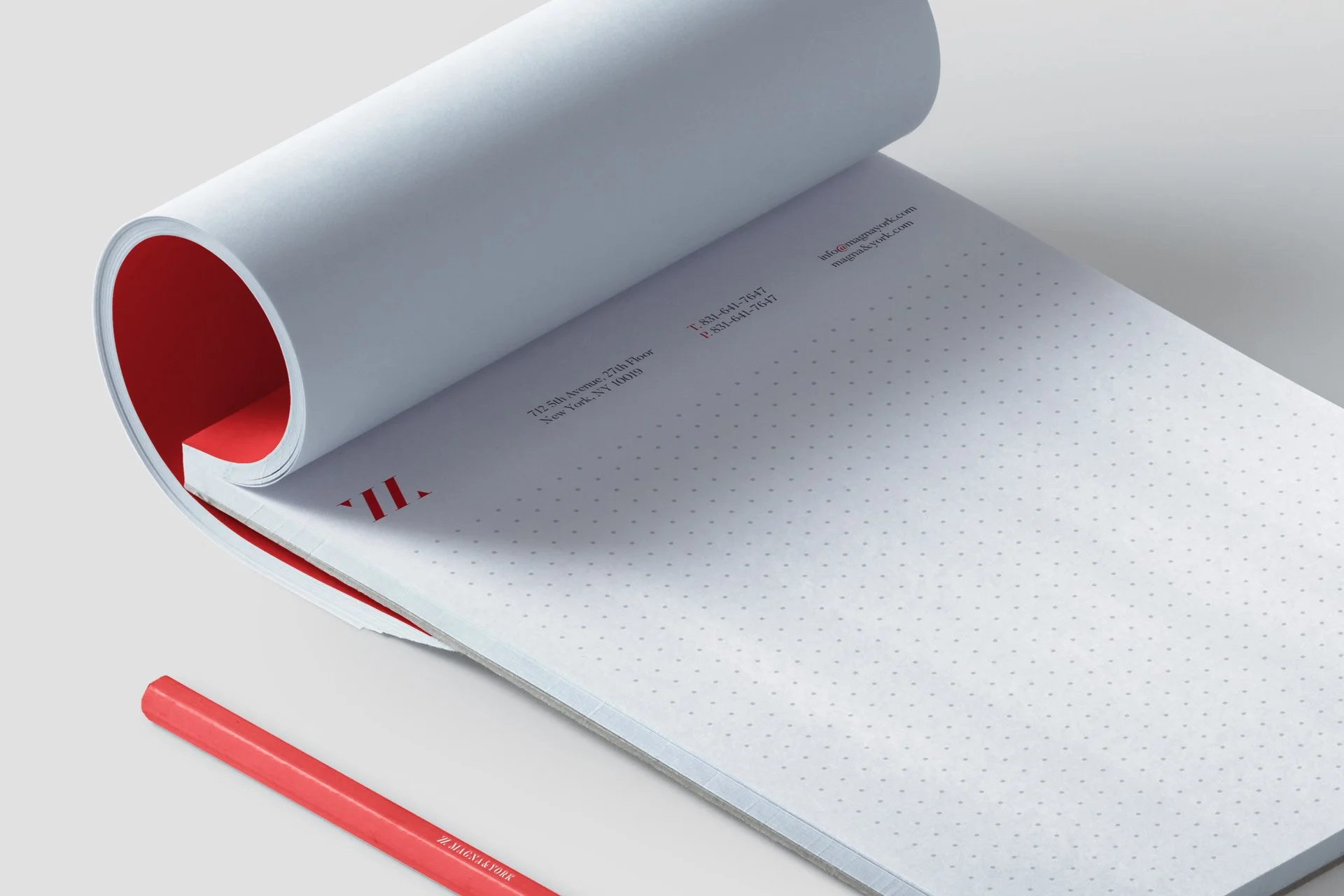
The same philosophy guided the development of the corporate stationery. Inspired by the company's promise, “Our Word Is Our Bond,” we created an extremely minimal visual system in which every element serves a clear purpose.
Unnecessary decoration was eliminated, allowing the company's name and essential information to take center stage. Through considered typography, balanced compositions, and generous negative space, the identity communicates professionalism without demanding attention.
The result is a refined, minimalist, and timeless brand identity that differentiates Magna & York within the competitive New York real estate market.
More than simply creating an elegant logo, our objective was to build a visual identity that reflects the company's most important promise: a reputation built on trust, integrity, and lasting value.