Giortì
Brand Identity
Client Overview
Giortì is a premium banqueting and catering company built around the timeless tradition of bringing people together through food, celebration, and shared experiences.
Inspired by the Greek concept of celebration, the name Giortì embodies the joy of gathering, transforming an ancient cultural tradition into a contemporary brand experience. The company's vision combines elegance, craftsmanship, and innovation, offering a sophisticated approach to catering and event services.
The challenge was to develop a distinctive and memorable brand identity capable of communicating refinement, professionalism, and exceptional quality while preserving the emotional essence of the brand: the happiness of sharing meaningful moments.
The visual identity needed to feel premium without becoming overly decorative, balancing simplicity and sophistication to create a recognizable presence across corporate stationery and branded materials.
Scope
Brand Identity, Logo Design, Print Materials.

Why Elle Visual
Our creative approach began with a fundamental question: How can we translate the joy of celebration into a sophisticated and timeless visual identity?
Rather than relying on conventional catering imagery, we explored the cultural meaning and typographic characteristics of the name Giortì, searching for a visual connection between tradition, elegance, and human emotion.
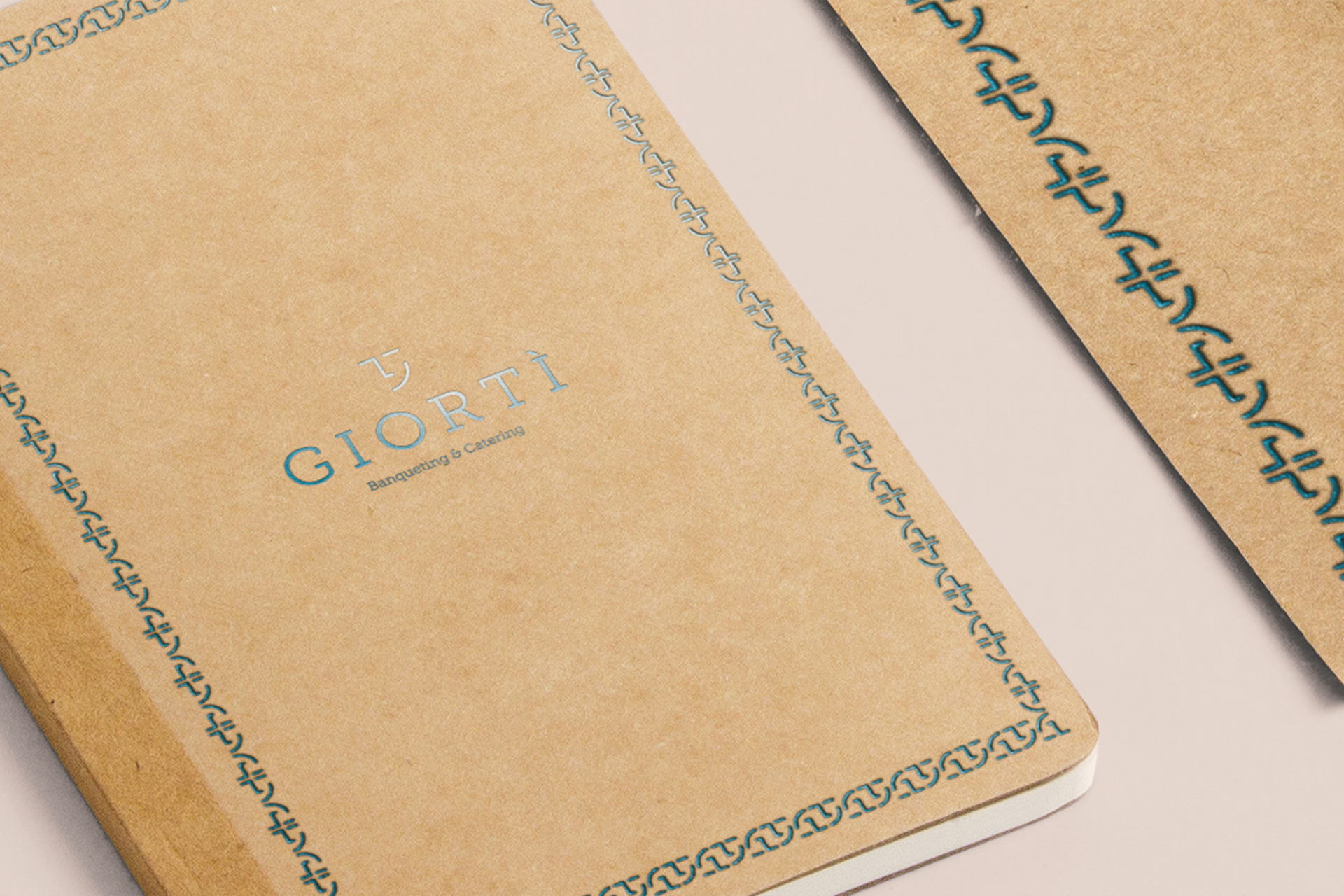
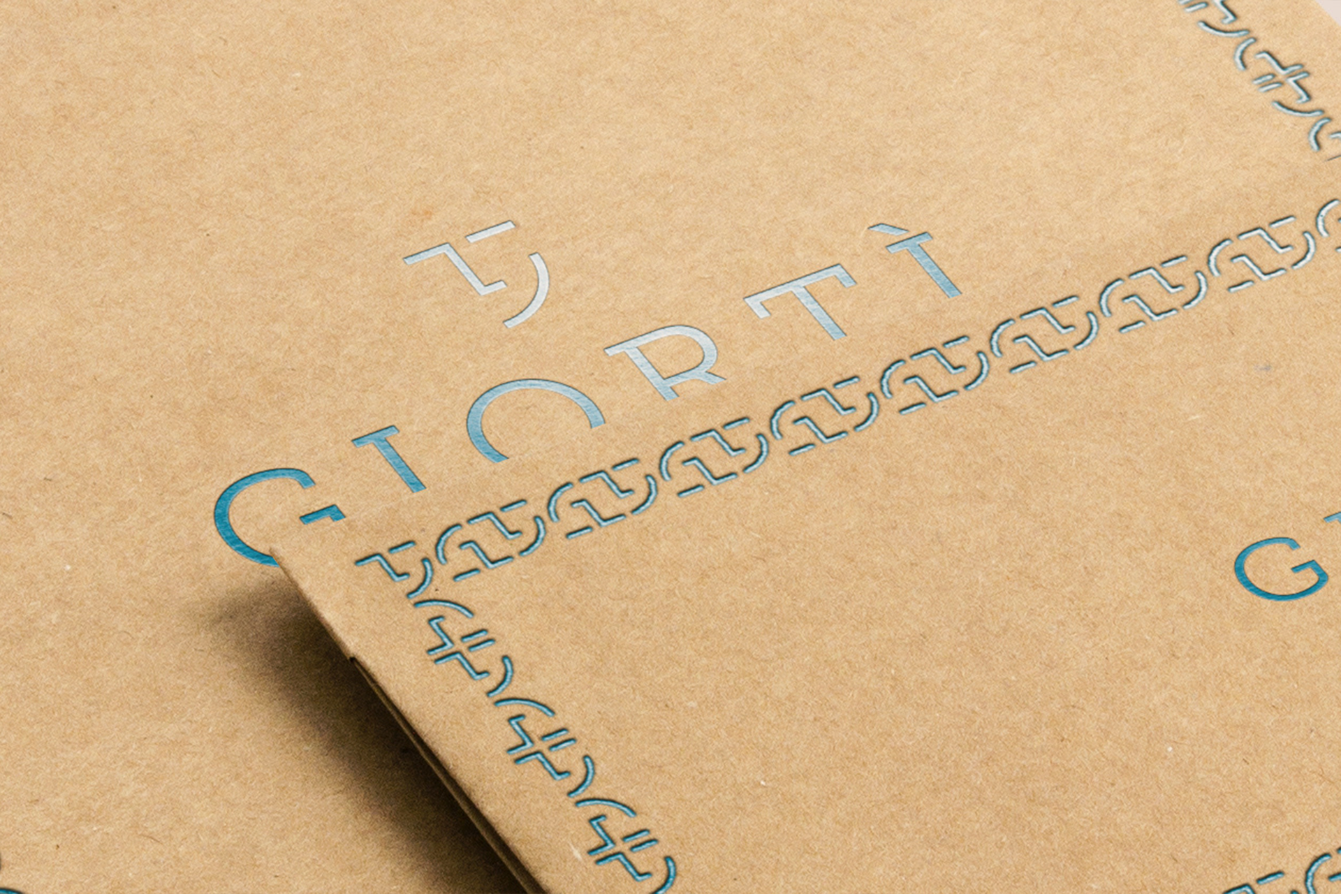
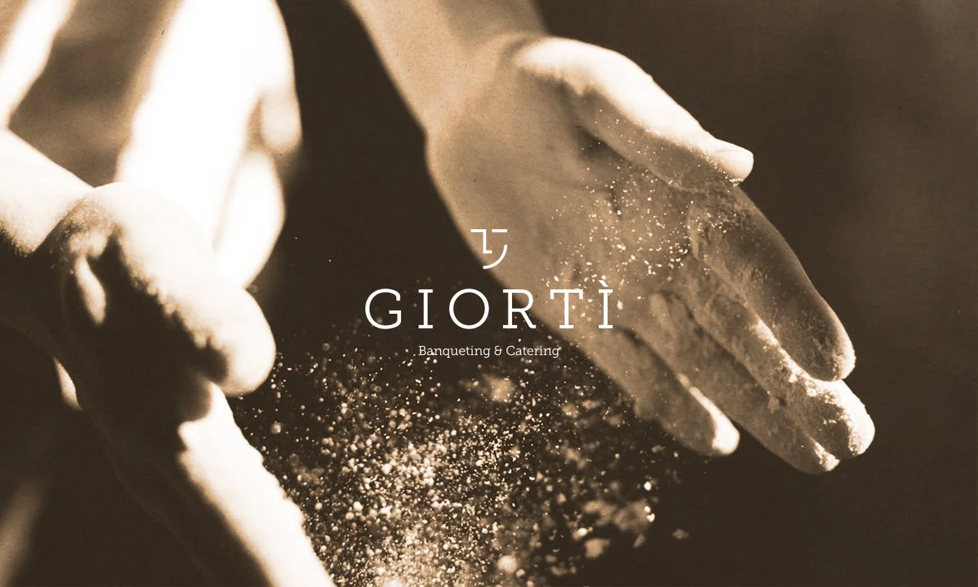
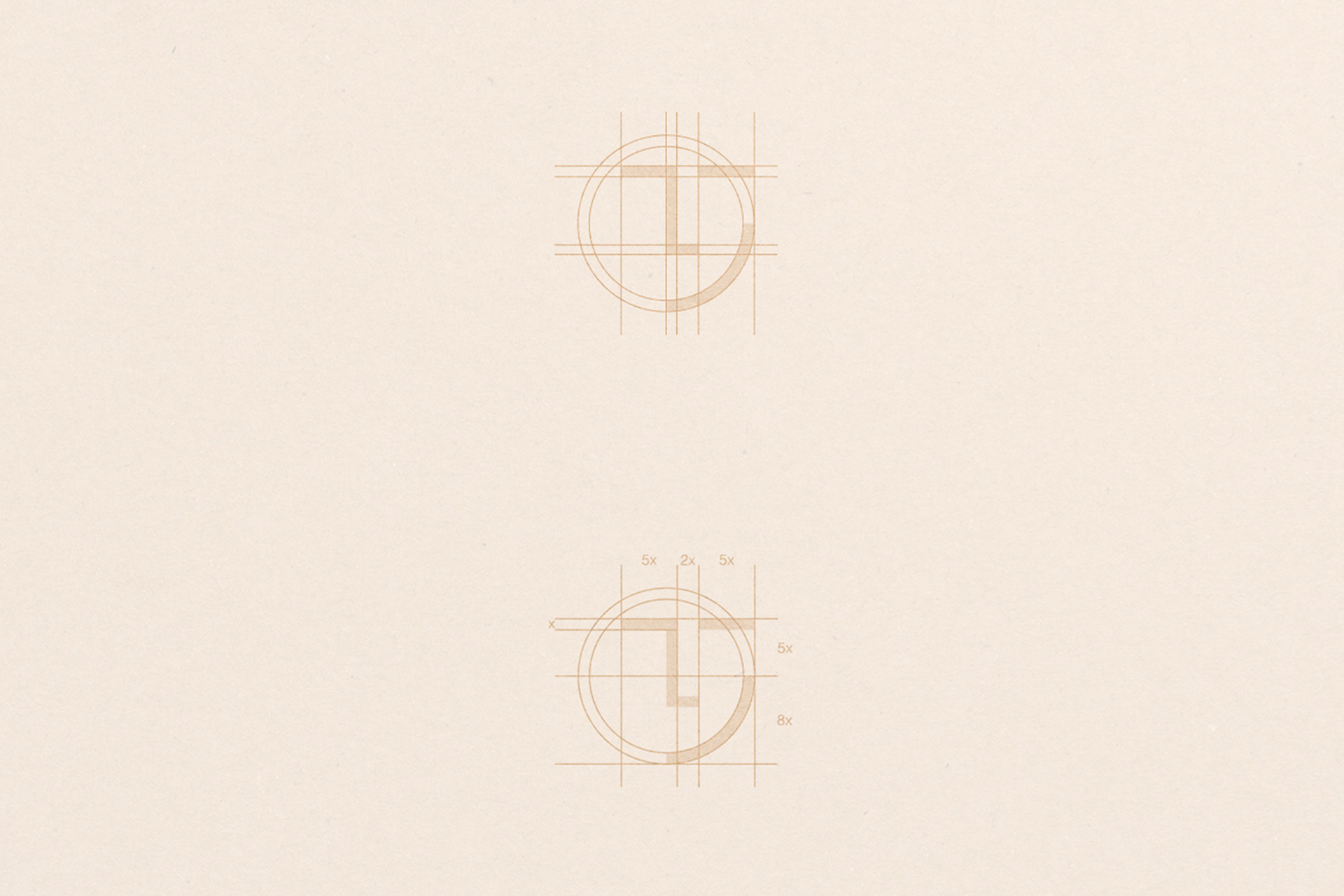
The creative concept emerged from studying the structure of the Greek word and reinterpreting its distinctive forms. By combining selected elements into a minimalist geometric composition, we developed a unique pictogram that subtly resembles a smiling face.
This visual connection was intentional. The smile represents satisfaction, happiness, and the positive emotions associated with successful celebrations. It transforms the logo into a meaningful symbol of the company's most important promise: creating memorable experiences that leave people satisfied.
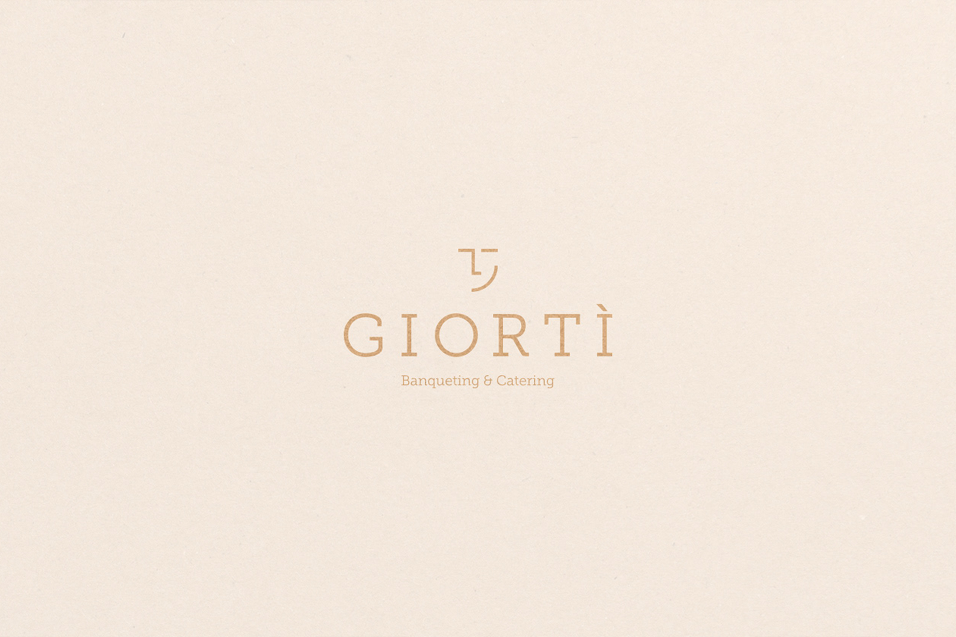
The result is a clean, modern, and recognizable logo that communicates personality through simplicity while maintaining excellent versatility across different applications.
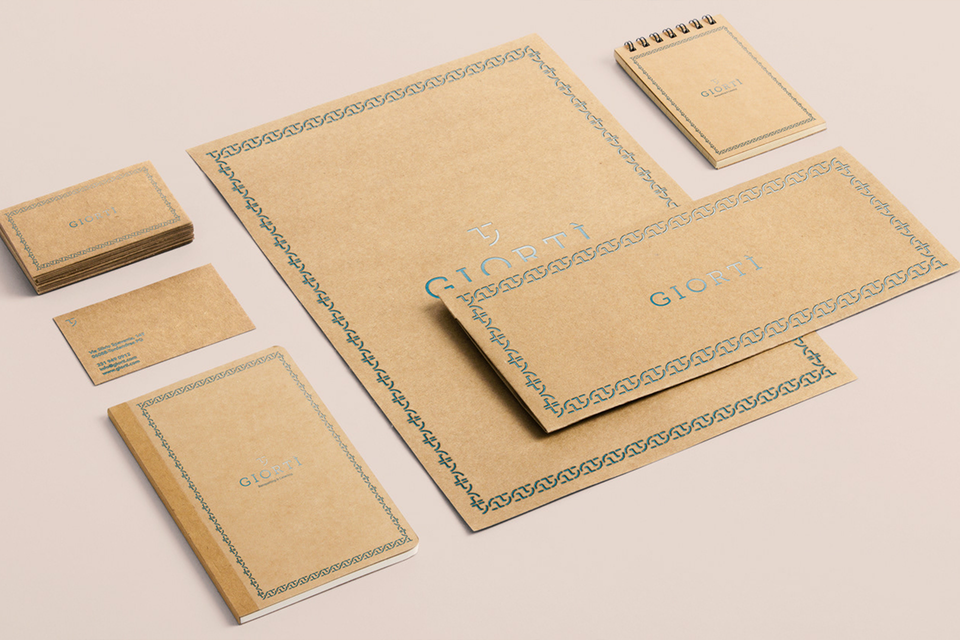
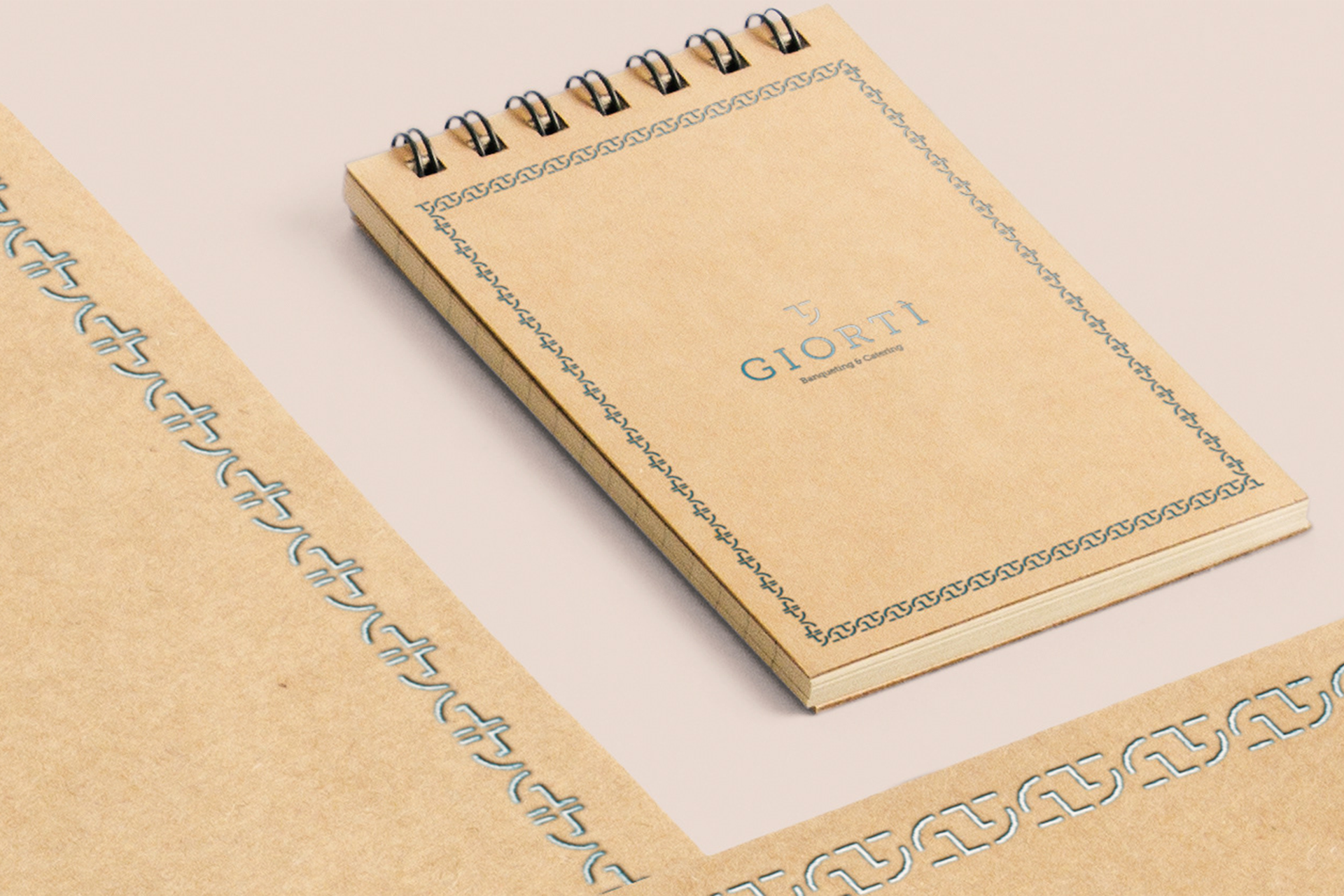
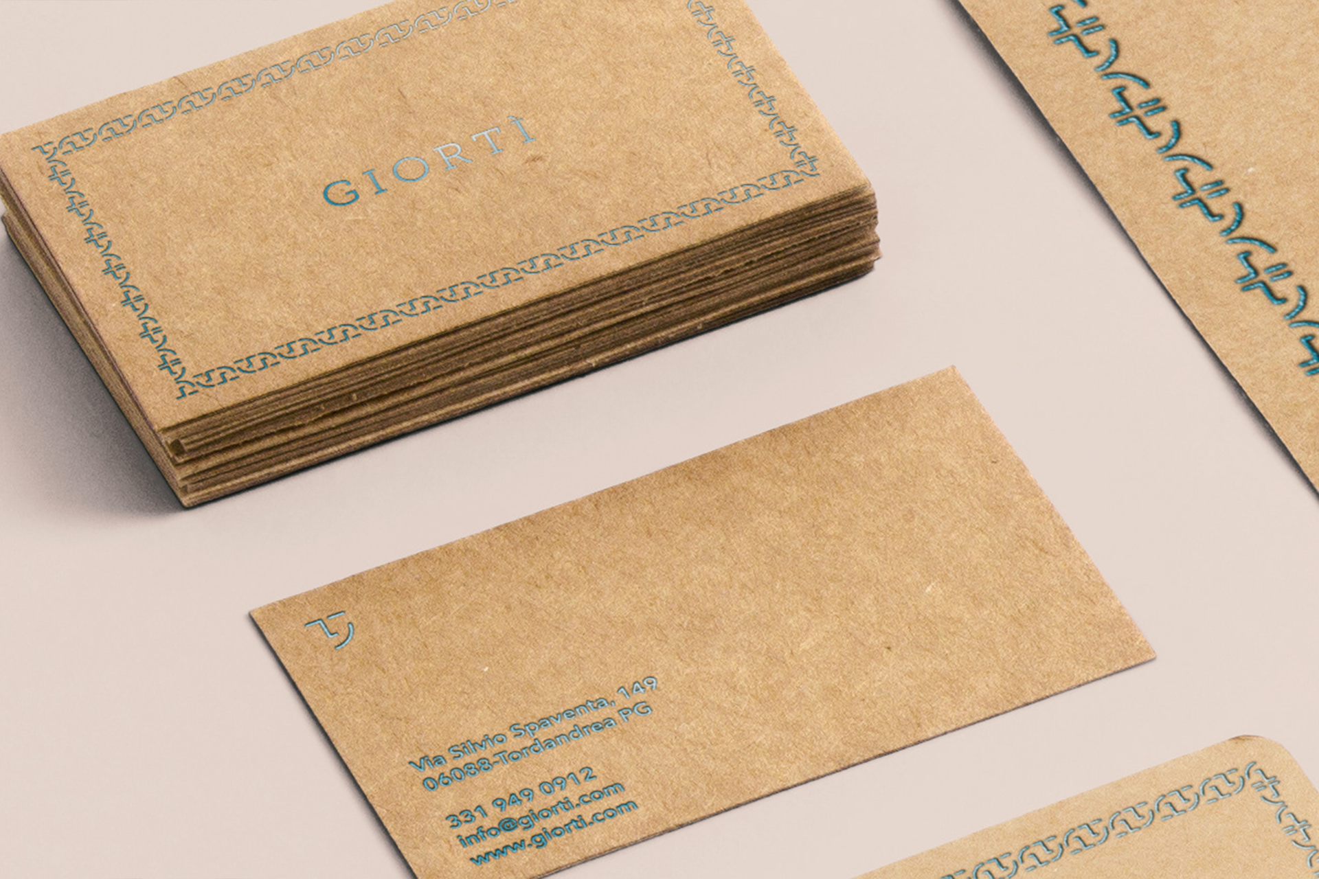
To reinforce the brand's premium positioning, we extended the identity into a carefully considered stationery and print design system.
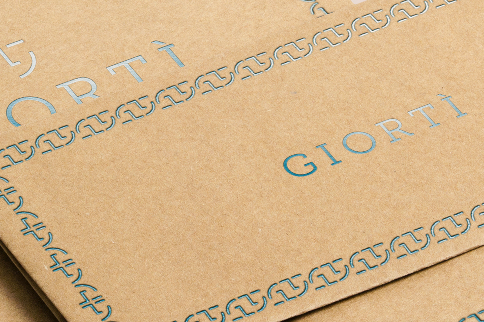
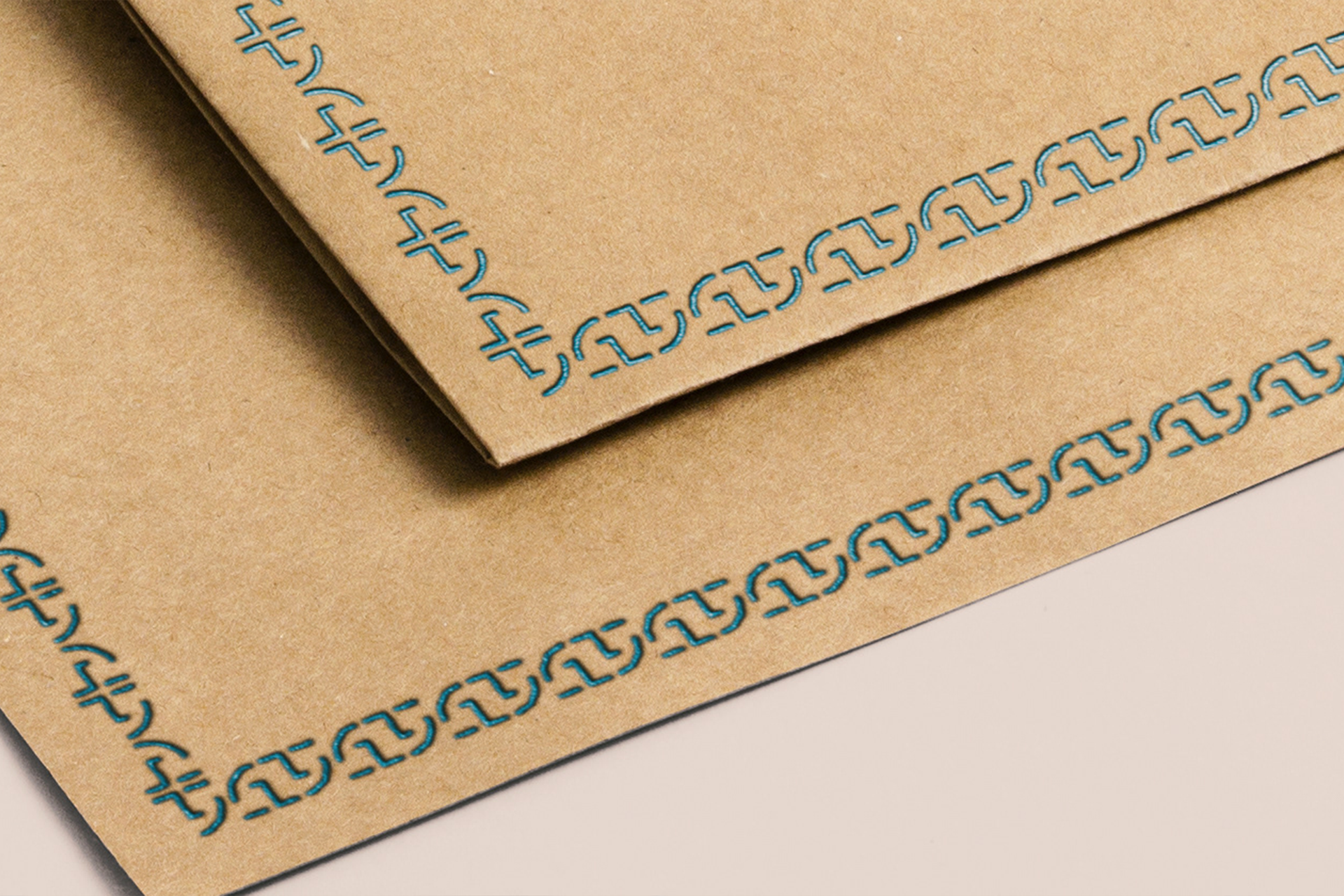
Cardboard was selected as a primary material to introduce a tactile, handcrafted quality, reflecting the company's appreciation for authenticity and attention to detail. Refined foil printing adds a subtle sense of exclusivity, creating an elegant contrast between natural textures and sophisticated finishing techniques.
Every design decision was guided by the same philosophy: true elegance comes from meaningful simplicity, not unnecessary decoration.
The final result is a distinctive and timeless catering brand identity that balances craftsmanship with contemporary design, communicating Giortì's professionalism, passion, and commitment to exceptional experiences.
More than a logo, we created a visual expression of what Giortì represents: the simple pleasure of bringing people together and celebrating life's most meaningful moments.